« Hokkei Dragon (2) - Poem tracing | Front Page | Mokuhankan now accepts credit cards ... »
Aspen Grove (5) - Printing experiments ...
Posted by Dave Bull on May 15, 2006 [Permalink]
Continued from Aspen Grove (4) | Starting point of the thread is here
The Aspen Grove blocks are in Japan ... Mike made a special crate for them, with only one 'entrance' - through a dozen strong screws on the top. By the time it got to me, it carried a strip of tape marked "Opened and resealed for Customs inspection", so I guess they must have gone at it with a screwdriver!
Not sure why they bothered ... Perhaps when they saw 'nothing' on the x-ray they were curious about a hidden compartment? Or maybe it's just that they needed to open it to figure out if they should charge duty/sales tax ... (They didn't)
This is one cool set of blocks! The photos Mike sent earlier (on the previous page) show the faces, but give no sense of the carved effect. Here are a few angled shots that try and show the actual carving ...
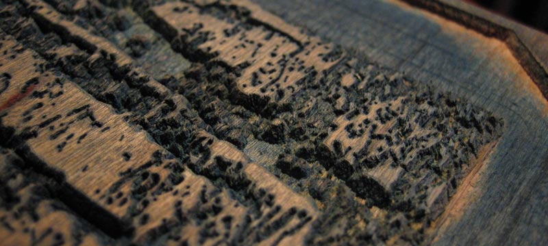
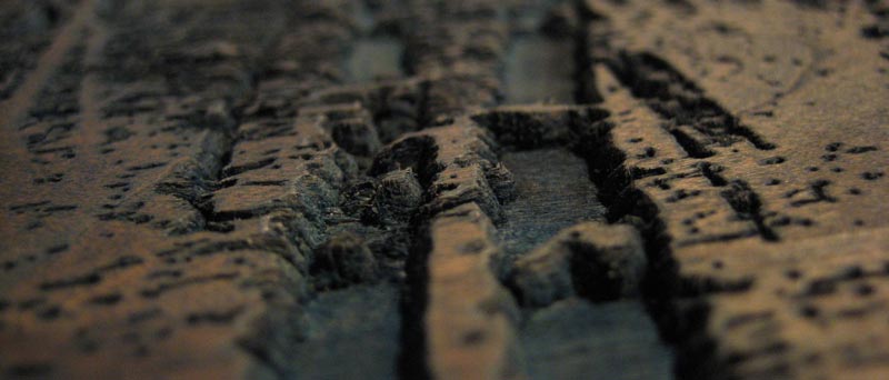
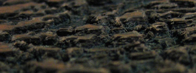
First surprise for me when I saw them was just how thin these blocks are. For the second set of blocks Mike made, he mentioned using 3/4" maple, which seemed just about as thin as I would like to go, but he didn't say anything about the thickness of this cherry laminate set. They are thin, only 16mm! This was fairly common back in the really old days, but for most of the last 100 years or so, with good wood impossible to find, it has been customary to work with thicker pieces; 23mm is typical.
This stuff is going to warp, and it is going to warp a lot! Mike's proof copy shows no evidence at all of any misregistration, but I know he works pretty quickly, and he only made a few copies, so didn't have wet wood sitting on his bench for an extended period. But for printing a large edition it's going to be impossible to keep this wood stable during a run. As soon as the water hits the printing surface, the wood starts to bow upwards. This can be kept somewhat in control by moistening the back side too, but that just means that the whole plank starts to grow wider and wider. Only 'solution' is to dunk it in the tub for a time before printing, to let it drink what it wants to drink before printing starts ... and do this with all the blocks similarly ...
Another thing that is going to cause trouble is the laminations. During my test printing this afternoon, I found one of the blocks had a strip that absorbed water much more than its neighbour, and swelled to the point where there was a distinct difference in surface levels. I'll try and take a shot of it under extreme angled light ...
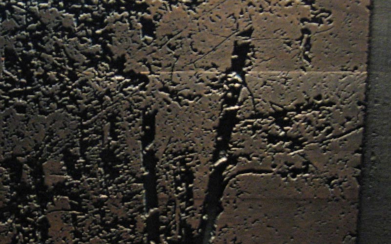
In a classical design, this would be fatal - the line would show clearly in an area of flat colour - but perhaps in this rather 'scrambled' design it will go unnoticed ... we'll see. (It can also be 'fixed' by grinding down the surface with a flat sharpening stone, but that'll 'open up' the carved areas a bit ...)
Anyway, on with the test printing. This print is essentially a 'reduction' print - the method that uses a single block which is gradually cut smaller and smaller as the process goes on. As the block is thus destroyed in the process, Mike has produced a fixed set of blocks this time, but they are designed in the same manner - starting with the first one, they are 'cut back' bit by bit, so that the printed area becomes gradually smaller and smaller.
One 'side effect' of this technique - the thing that differentiates it from other types of woodblock work - is that there are no 'three-way' overlaps.
Imagine a set of three blocks with overlapping areas:
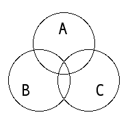
When you alter the pigment applied to block A, you end up changing parts of both B and C.
But with a reduction print, the blocks are laid out like this:
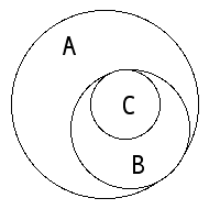
A covers everything, is cut back for B, then cut back still more for C, etc. etc. When you change the pigment for any particular block, you also change everything 'up the line', but nothing below it.
Now I've never printed anything quite like this before, so I need to learn how to control the pigment application from step to step. Because the later blocks all build on previous blocks, there are two basic approaches to use: print everything with the same intensity/colour/etc. and let the blocks themselves create the 'build-up', or alter your pigment each time, thus adjusting the 'natural' flow of the build-up.
Mike talked about this in his post the other day:
The first four or five printings should each be of a single pigment (gray or blue or green "“ whatever) and if that pigment is not black, then black should be added to the last three or four printings "“ when printing a color (like blue for example), the result of simply printing that color in more and more saturation will NOT produce a pleasing result.
But because I don't have a clue about how to approach that second method, I'm going to make a trial with the first method - using a single 'colour' for every block, and see where it takes me. 'Not a pleasing result' or whatever ... but by studying that, I'll have a 'base' from which to try further variation.
Today was mostly printing for my Small Print Collection, but between impressions on that, I worked with these blocks too. That's actually a very good way to do this print, because with impressions that have such wide 'cover', the paper gets saturated quickly, and needs to be rested after each impression.
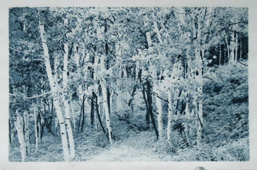
I used a simple light grey, to try and keep things basically neutral, but this quickly became slightly greenish, after picking up residue from Mike's proofing with indigo. I also kept the pigment application on the light side, because I think Mike's proof is kind of dark and oversaturated. Here's the result, eight basically even steps through the image, with no additions or changes to the pigment as I went along:
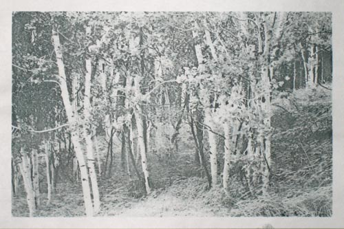
Pretty 'washed out', as Mike suggested would happen. I printed with pretty light touch, and got some nice definition in the foliage details though. But that's where we'll have to leave it at the moment. I won't have a chance for another go tomorrow, but should be able to try it again on Wednesday.
Just for fun though, let's have a little Photoshop foolery on my proof, to give a taste of what I'll try for ... not much change at the lower levels, more saturation at the top, and more of a 'bluish' cast ... (click it for a popup)
Once I've got a pleasant effect with the blue-grey, I guess I should try an 'all-blue' version like Mike's. Problem with doing that though, is that once the blocks really get covered with blue, it makes it very difficult to do anything else with them!
This thread continues in Aspen Grove (6) ...
Added by: Mike Lyon on May 17, 2006, 12:31 am
Hi, Dave --
I enjoyed your explanation and illustrations of the adapted reduction method I used for these blocks -- it's very clear and correct and accurately describes the approach, I think.
Your trial printing using identical ink saturations for each block is not the 'right' approach, as you've already discovered... The method is happily VERY forgiving, because no matter WHAT ink density is used for each block, each subsequent printing (so long as you don't allow the paper to become damper than the block) adds SOME pigment to the printed image, so the image is communicated regardless.
If you conceive that each printing adds an equal amount of pigment, it is easy to see that the color space becomes quite compressed in the darks. That is, the visual difference between lightest values will be much greater than the difference between the darkest values. This can be used to good effect in certain images, but probably not the best approach for this image!
Here's another way to think about this... The first printing (using the same ink for each printing) will produce the greatest contrast in the entire image -- the difference between the paper color (0% pigment) and the first printing (say, 10% pigment) is an enormous step and will be very clearly visible in the print. The second printing of 10% pigment will roughly double the darkness of the first and so will be less pronounced than the first step from white paper to lightly pigmented paper. Then the thrid printing will also increase the darkness, but only by a third, then next by a fourth, etc until the final color (8 blocks) will add only 11% more color (theoretically -- in actual application, the increasingly damp paper will tend to pick up less and less pigment from the block which will make the steps in the darks even less pronounced.
In order to achieve visually 'equal' steps in value from paper to lightest ink, next-lightest ink, and so on, the first pigment must be quite weak (say, 5%), and then each subsequent inking must have a bit more pigment -- I sent you a sort of 'guideline' grayscale suggesting what might be a good start toward this...
Even with your Photoshop-adjusted image the steps between the lightest values are quite a bit more pronounced than the steps between the darkest values, I think.
Unlike 'genuine' reduction method, this block set does make experimentation and variation EASY, so I'm confident you'll have it all under control in short order!
---
Block warping etc.
First, don't worry TOO much about the unequal expansion in that area -- it really won't detract from the final image I believe, at worst leaving a lighter than intended horizontal stripe, but there is SO much going on here that I don't think it will be noticed (and it is going to be mostly overprinted by subsequent blocks)...
Warping -- in this you have much more experience than I. My largest edition was 'only' 100 prints, and it was a single block reduction in about 18 steps of a 2 inch thick plank, so that really doesn't speak to the current block set. But I'll offer my thoughts for what they're worth anyhow and perhaps something here might 'click'.
First, the thought of really saturating the block is pretty abhorrent to me -- and I think that would really make any warping much worse! Better to place the block on a slightly damp cloth for printing so that both faces remain as equally and minimally damp as possible -- this was my thought in carving block 2 opposite block 1, etc. This reduction adaptation tends to put more and more moisture into the paper anyway, so in an over-saturated block, that problem will be even worse, I think. Try to keep the blocks as un-damp as pratical!
A 'drier' block will also tend to promote a certain granularity in the way the pigment builds during printing which acts to somewhat obscure the individual block contours. The idea here is, using only 8 blocks, to try to produce something akin to continuous tone and NOT to try to highlight the exact contour of each individual printing area.
The block carving has been done so that it is possible also to screw the block down to another block or a table top which, on these small blocks, will likely prevent any appreciable warping during printing -- that's easy to do and worth a try -- I've done it many times on other blocks and (so far) have not had one crack as the result of being held fast.
Also, I believe that you've picked up on the vacuum hold-down idea already -- if you can tolerate the noise of the vacuum, that works incredibly well to hold blocks both flat and still during printing. Let me know if you want more information, as I have now made quite a large number of vacuum plenums for this very purpose!
Anyway, GOOD LUCK, Dave! Looks like it's coming together very nicely, and I like it in shades of sumi very much! Maybe you'd like to produce several variants (a gray version, a blue version, a gray-green version)?
Best to you always,
Mike

Added by: Dave on May 17, 2006, 6:04 pm
so I'm confident you'll have it all under control in short order!
Hah! 'Short order' is not likely here ... Mike has been playing with these kind of prints for a few years now. To suggest that I could top his skill at this with my first couple of proofs would be quite some insult to him!
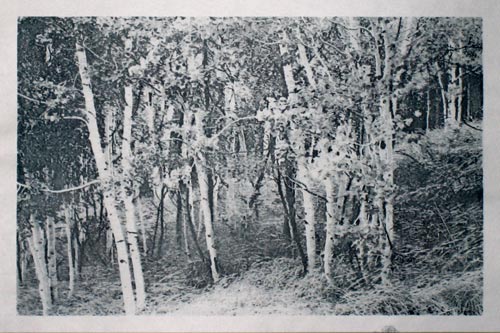
Here's today's result. (As usual it'll click for a larger version, but this time I have also uploaded an even larger one):
This kind of printing is indeed a very difficult thing to get your head around. I've now done my second proof - better than yesterday's no doubt - but as I sit and look at it, I have to admit that it is far from obvious just what has to be changed to improve it. The layers at each 'end' of the tonal spectrum are fairly easy to see; I think I've got close to the right darks, and I definitely need to increase the bottom two - maybe three - layers somewhat, but what needs to be done in the middle - in that jungle of grasses and branches - is opaque to me.
Back to the 'printing board' tomorrow!
As for other things, I am indeed having a hell of a time with block warping. Maybe it's because we are now in the rainy season here, or just that this wood is extremely dry and thus very thirsty, but I can't even get two or three warm-up impressions taken off any face before it starts to arch up on my bench (even with the back side moistened).
the thought of really saturating the block is pretty abhorrent to me ...
You do what you gotta do to get the block to behave. At one side of the room where the Yoshida printers work is a small stainless steel tub. As they are mostly re-printing old blocks (from Hiroshi and Toshi), this tub gets plenty of use, with blocks being either 'drowned' in it, or floated on top to moisten one face. The idea is simply to try and stabilize a block before printing, rather than have it squirm around on the bench while you are working.
It doesn't damage them at all, and after printing, they are stood up on one end against the wall to slowly dry out again before storage.
I think what I might do with these is screw on hashibame, a cross-piece on each end, to try and reduce the arching.
I like it in shades of sumi very much! Maybe you'd like to produce several variants (a gray version, a blue version, a gray-green version)?
Well, I think what we'll probably do with this one is simply put a few options on the table and then let you (Mike) decide how you want it presented to people. As there are already a half-dozen orders based on the proof you showed, it would certainly seem that your own conception should be the one to 'rule' (although the idea of offering alternate versions and letting people choose between them isn't such a bad idea either).
Added by: Tom Kristensen on May 17, 2006, 7:55 pm
Thanks for this incredibly instructive tutorial.
So far my favourite image is the last one printed by Dave. I am quite happy with shades of gray, and the concept of a duotone is also good. If the concept is moonlight, it could be that the midtones should be subdued so that there is more contrast at the dark end. I like the idea of added emphasis on the dark strokes in the composition, like a Jackson Pollack.
Keep up the good work,
Tom
Added by: Julio Rodriguez on May 18, 2006, 10:22 am
I agree with Tom, very interesting and quite a tutorial...keep the conversation going !
Added by: Mike Lyon on May 21, 2006, 12:39 am
Hi, Dave -- you've gotten 'closer' with this one, but I think you're all concentrating on the wrong end of the scale -- the steps between the LIGHTS need to be a bit larger, I think... A bit deeper in the first four blocks, then a bit closer together at the end -- it's alright if the color doesn't go all the way to black at the end -- don't be impatient, concentrate on getting clearly defined steps in the beginning (not TOO huge, or you'll run out of color space before you run out of blocks, of course), but I think it's the lights which require more definition in order to make this image 'sing'... The information is all there, just jumping a bit too much at the very end and not quite enough at the beginning, I think...
It's really not very difficult at all, as you've already discovered in spite of your comments -- the magic is that this neo-reductive approach AUTOMATICALLY produces correct positive steps throughout printing, so there can be no uncomfortable value reversals in images built up this way...
Perhaps I should have taken a bit of time to produce some proofs I liked before sending off the blocks? Oh, well... Too late now! But I think you're doing quite well on your own!
Best,
Mike
Added by: Mike Lyon on May 21, 2006, 12:42 am
OH! One more thought -- just drill a couple more holes in the cleared outline on the right side of each block, then hold the block down (even to a plywood support) with four screws -- that's quite quick and easy and you won't have to dado a slot in each end... Or just modify your vacuum hold-down which works great, by the way (but you'll have to plug the two existing screw holes with a bit of masking tape or it'll be too leaky).
-- Mike
Added by: Dave on May 21, 2006, 1:12 am
I had hoped to have another version to post this evening, but the one that came out today isn't worth showing anybody.
Trying to juggle a few too many things at once; I'm doing the printing for the 4th print in this year's little collection, and between batches, putting another impression on some more Aspen tests. But my head just isn't in it today (too full of stupid php code!), and I couldn't focus well enough to do it properly. (The little print is OK ... that kind of printing just runs on 'automatic').
just modify your vacuum hold-down ...
You're joking! Those blocks arch upwards strongly enough that I think they would hold me up if I stood on one of them! Screws maybe ...
Added by: Mike Lyon on May 26, 2006, 2:27 am
Hi, Dave --
Enjoyed your skepticism about a vacuum hold-down for blocks -- I'm pretty sure you'll be successful with screw-downs, but for possible future reference you might enjoy this simple calculation of the hold-down force of a vacuum system -- even for small blocks like the ones you're working on.
A shop-vac pulls a differential of between one and two pounds per square inch (ambient pressure at sea-level is about 15 pounds per square inch -- a vacuum cleaner like the Fein vac's I've been using -- they're independently fan-cooled, so don't require air movement to cool the motor -- reduces the pressure under the block to about 13 to 14 pounds per square inch).
The Aspen Grove blocks measure about 11 x 16 inches, I believe, so an area of something over 170 square inches. That means that a shop-vac will hold the block down with something between 170 and 340 pounds -- quite a bit more than your weight! If there's too much leakage to pull a vacuum under warped blocks, masking tape around the edges has proven effective.
Looking forward to seeing the next proofs!
-- Mike
Add Your Input