« Hokkei Dragon (1) - Tracing | Front Page | Aspen Grove (5) - Printing experiments ... »
Hokkei Dragon (2) - Poem tracing
Posted by Dave Bull on May 14, 2006 [Permalink]
Continued from Hokkei Dragon (1)
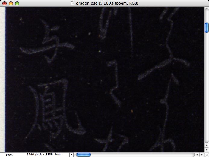
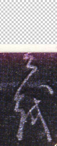
The poem on this print is going to be very difficult to reproduce - it is printed in a light silvery coloured powder over black, but as the silver has oxidized and blackened over the years, it is far from clear.
Here's what I'm faced with (The area here is just around 15mm high in the finished print):
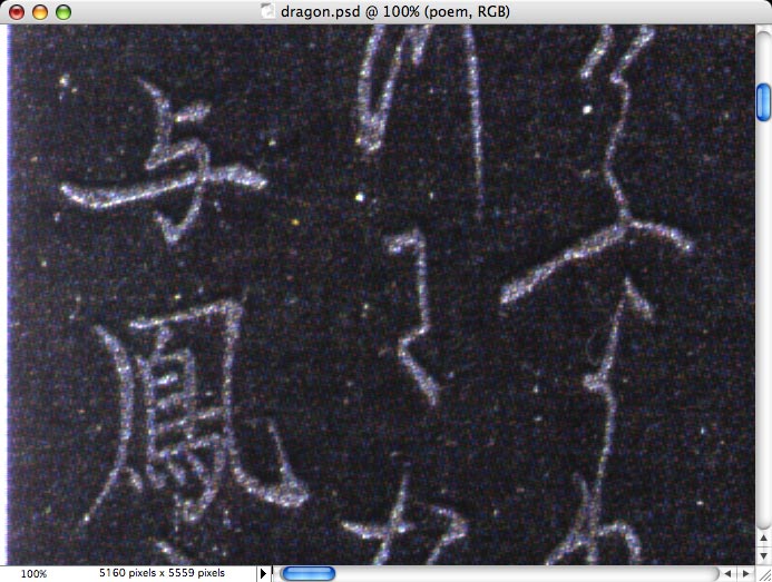
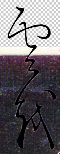
Photoshop to the rescue! After some experimentation with brightness and contrast, we can make it jump out much more clearly:
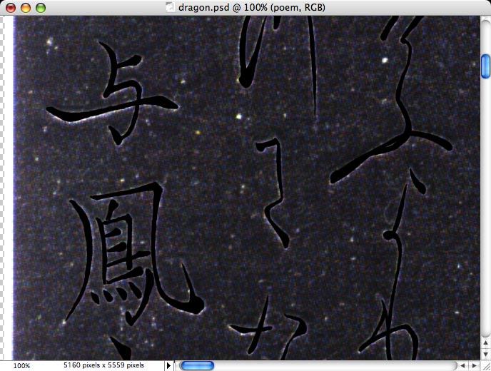
I then proceed to carefully trace over the characters ...
... and once the background is erased, I'm left with a good sharp outline of the poetry.
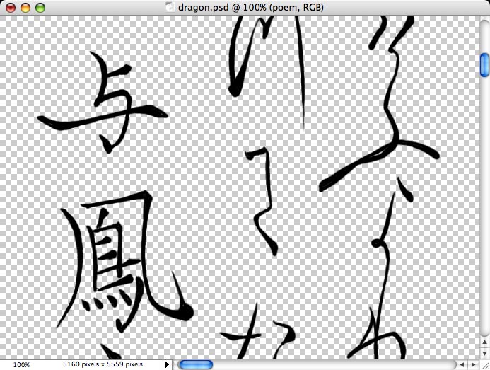
If you compare carefully my version with the silvery original, you might feel that my characters appear to be a bit on the 'thin' side. There are two factors in play here. There is a fair bit of tamari on the original. Tamari is the slight 'fringe' of unwanted pigment that sometimes surrounds a printed area in a woodblock print. If too much pigment/paste is used when printing, tamari will show as unsightly blobs around the lines. In this case, it is very slight indeed, but is present here and there. I of course try and avoid including these areas in my tracing. I'll have my own problem with tamari at printing time, and don't need to include it now!
But a second reason for the 'slimness' of my characters is that when you carve this kind of block, you don't carve 'what you see', you carve a block that will print 'what you see'.
What I mean is that as there is almost inevitably a slight expansion in the wood when the wet pigment is applied at printing time, it is better to cut slightly on the slim side. At this tracing stage, it's impossible to foresee exactly how much expansion will occur, but my experience tells me that this level of slimming is about right for the wood I expect to be using.

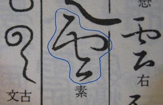
Another problem with this job is that the original print has been trimmed a bit too aggresively, and the top section of three of the characters is missing. Now I've gradually been getting a bit more skilled at reading Japanese, but as for writing, and in a two-hundred year old style ... no way!
But I am very familiar with the style of this calligraphy, having made reproductions of a number of surimono from this era, most of which have calligraphy that was probably drawn by the same specialist. So to get close, I looked up the characters in a 'Dictionary of Old Writing Styles' that I have here, scanned them into Photoshop, and then used those as a guide for rebuilding the missing portions of the poem.
Here's part of the relevant page from the dictionary, and then the trimmed print on the left, and my 'reconstruction' on the right:
And in a great stroke of luck this afternoon, just as I was partway through this job, there was a knock on the front door ... and it turned out to be one of my former collectors who lives in the area, calligraphy teacher Kaneko-san, out for a Sunday afternoon walk!
I dragged her into the computer room and got her advice/assistance on finishing off the job. And it's good I did, because although she praised my work on the missing poem sections, when I had tried to reconstruct the hidden part of the seal at the lower left of the design, I had completely misunderstood the characters, and had botched it completely. She set me straight, and I think now we will have a print that will 'fool' even the men who wrote the poems!
This thread continues in Hokkei Dragon (3) ...
Add Your Input