« Watanabe vs Adobe ... | Front Page | We're Open! »
Aspen Grove (4) - Next proof ...
Posted by Dave Bull on May 7, 2006 [Permalink]
Continued from Aspen Grove [3] | Starting point of the thread is here
Getting closer ... we continue with an email from Mike ...

From: Mike | Date: May 7, 2006
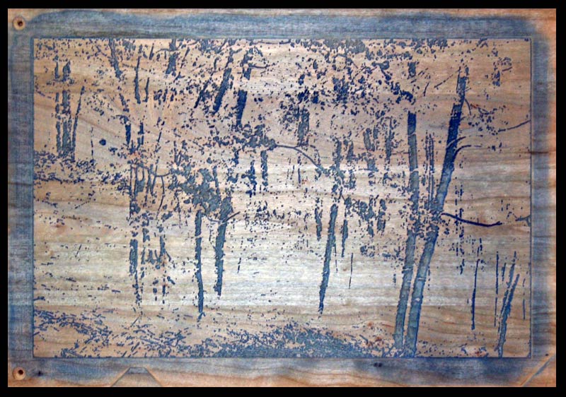
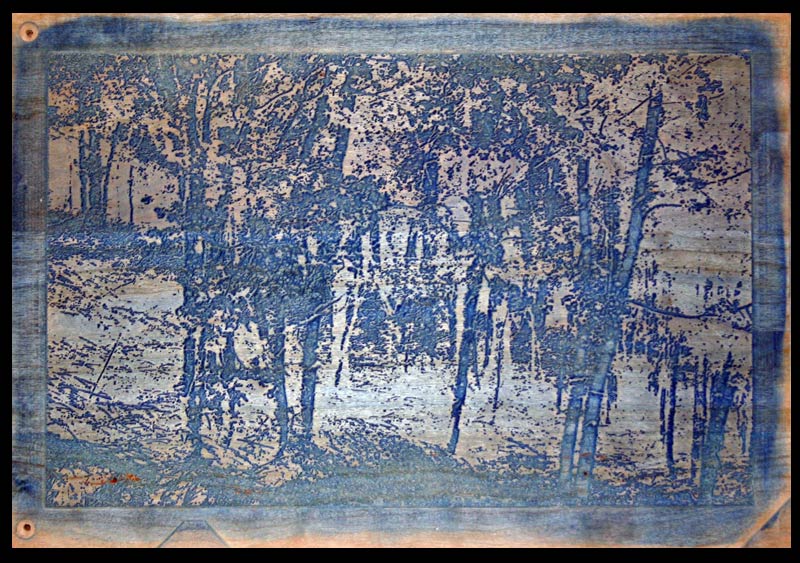
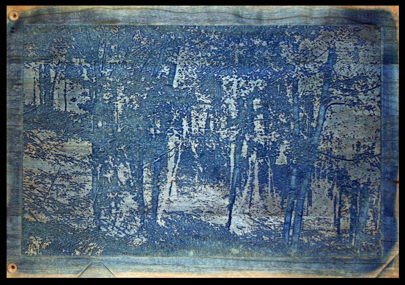
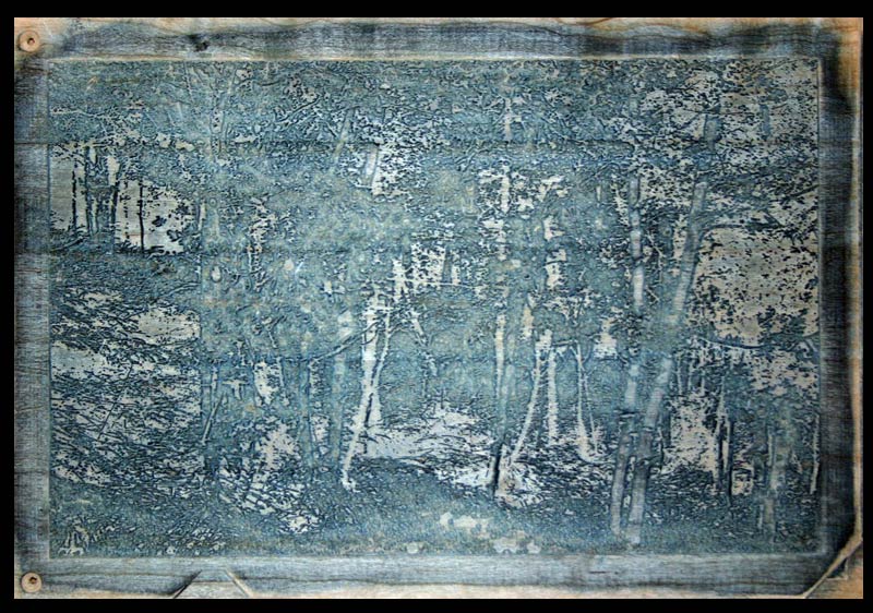
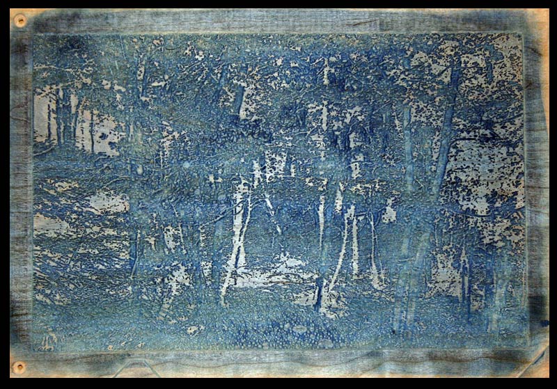
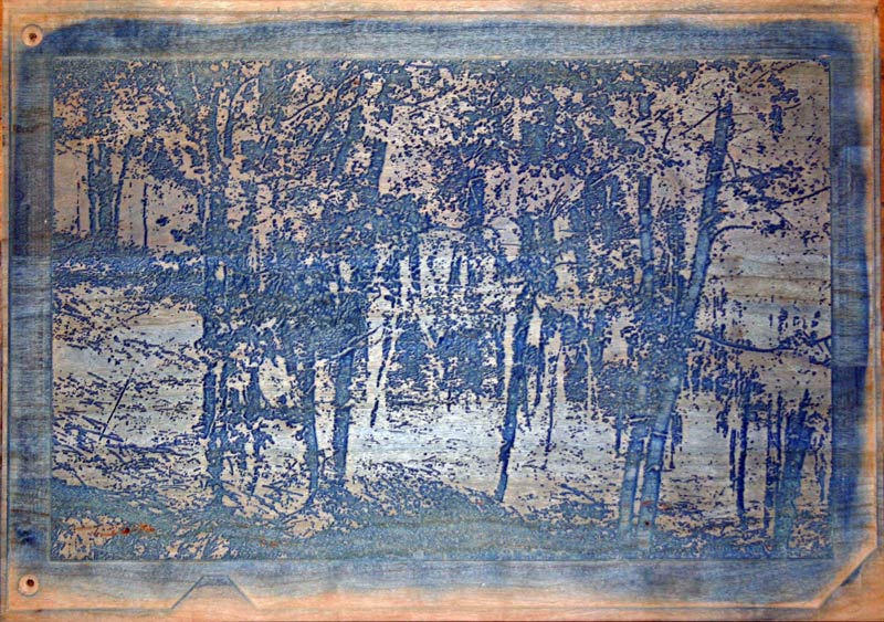
I still have a tiny bit of clean-up to do on the blocks (to remove some 'fuzz' at the image borders), so have not yet packed and sent them, but here are photos of blocks and prints "“ block 0 is maple, the rest are cherry. I think it could make an effective print "“ might be most effective as a sumi-zuri-e instead of a blue picture, actually "“ I think for gray images I prefer a 'graphite' pigment to sumi for the grays, adding sumi in the last 3 or 4 blocks to deepen"¦ These could also be printed in green, but I imagine the effect will be best in grays.
 |  |  |
 |  |  |
 |  |  |
In this print it will be important to make clearly pronounced color steps between the three lightest blocks (which I did not achieve in my proofs) "“ here's how I think about color steps: There are 8 or 9 blocks in the set depending on whether block 0 is printed. The set should be printed from lightest block (0 or 1) to darkest (8). Let's leave block 0 out of this discussion since block 0 is intended only to compress the color space and reduce perception of the steps between colors. Each subsequent block prints onto areas printed by ALL previously printed blocks.
As a practical matter, this makes controlling the dampness of the prints somewhat more challenging than with a 'normal' block set "“ the printer will have to take special care that the paper can fully relax and moisture equalize before printing each subsequent block. Because each block prints on top of all previous printings, the control of color is slightly non-intuitive in that less pigment is required to achieve a 'step' than you might imagine.
The first four or five printings should each be of a single pigment (gray or blue or green "“ whatever) and if that pigment is not black, then black should be added to the last three or four printings "“ when printing a color (like blue for example), the result of simply printing that color in more and more saturation will NOT produce a pleasing result. But the color of the last "black" printing is actually a grayed-out color with a density of only about 50 to 60 percent (if printed on white paper it would produce a tone about half-way to black "“ not black "“ unless you want a SUPER-saturated print "“ such prints are interesting, actually, but too harsh for this image in my opinion, and you'll tend to lose definition in the darks if you approach printing in this way).
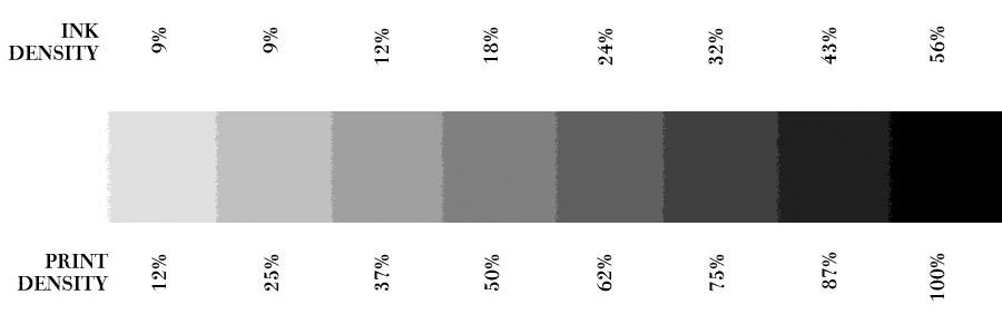
So an 'average' stepping from light to dark in blocks 1-8 would produce the following (approximate) %darks:
I hope that the printer will feel free to experiment in order to achieve an optimal effect "“ look forward to seeing some proofs from which we might select a BAT"¦
From: Dave | Date: May 7, 2006
OK, thanks for these proofs. I'll use one of them (with adjustments as mentioned below) for a 'sample' on the catalogue page, and will now try and get the place 'opened up' ...
Random comments ...
Woods: slightly (more than slightly!) nervous about using mixed woods for the print. There is no way that they are going to have the 'same' coefficient of expansion over time or under the impact of water. In this case - as you've obviously considered - it's not so important because the maple is 'blank' and thus registration is irrelevant, but I just want to emphasize that this is dangerous. (Sorry to preach :-) but it's better to mention this now, rather than run into trouble in the future!
Laminate?: the cherry is a laminate? (or whatever you call that stuff made up from thinner strips ...) I have no experience with such stuff; I imagine it must be very difficult to plane flat, what with varied grains running this way and that, but I'm more concerned about varied water absorption leading to stripes in the print. Are the blocks cut from one long plank of this stuff, so that the strips 'match up' from block to block? Or have you flipped/staggered them, to minimize potential trouble?
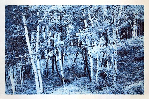
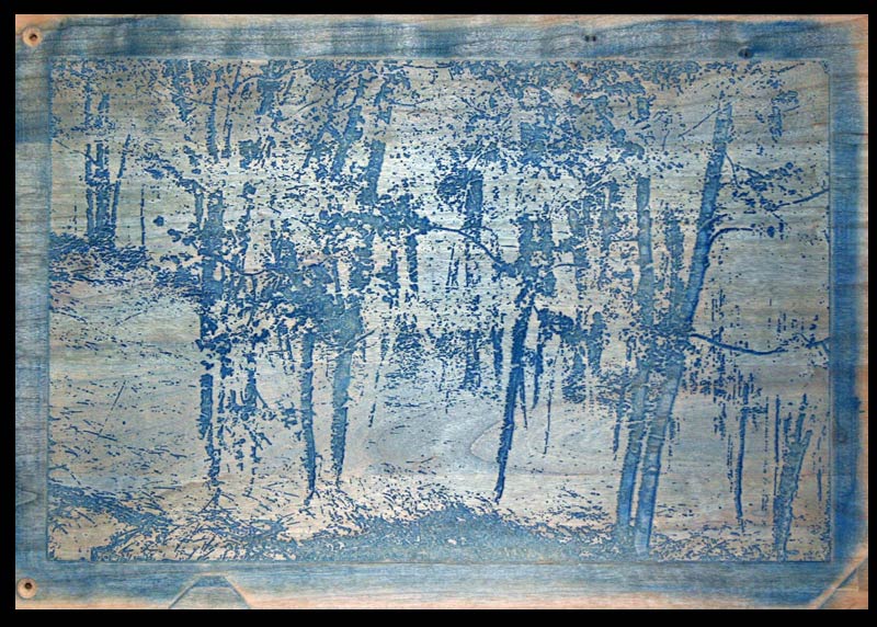
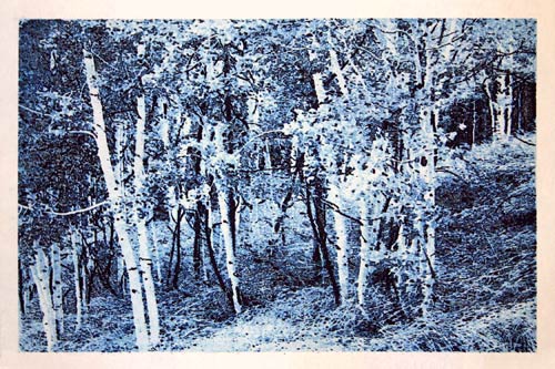
Colours: - grey/green/blue/etc. It's a bit difficult to consider this image in a different 'light', as we've spent so much time looking at it this 'blue' way. The grey blue could be effective, and on my list of things to try with the blocks is to see how much of a 'duotone' effect I might be able to get with them - thinking of a silvery-grey appearance. The obvious thought is that this could be a moonlit scene. And that leads to the idea of producing this print in both versions - daytime/nightime ... It's going to be worth experimenting with.
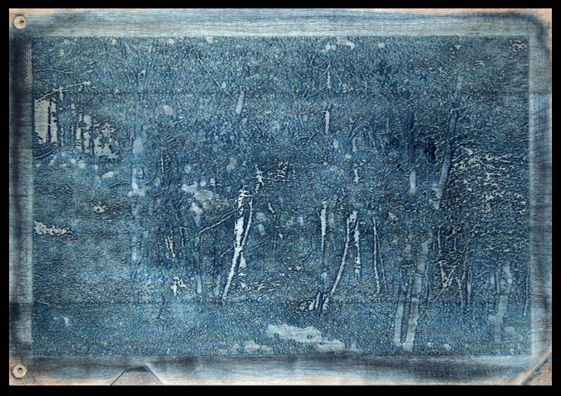
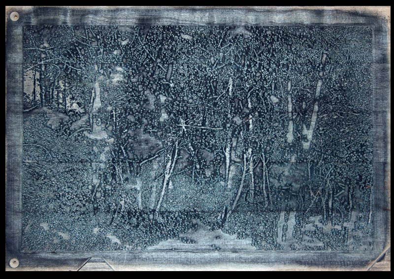
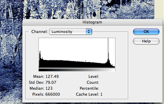
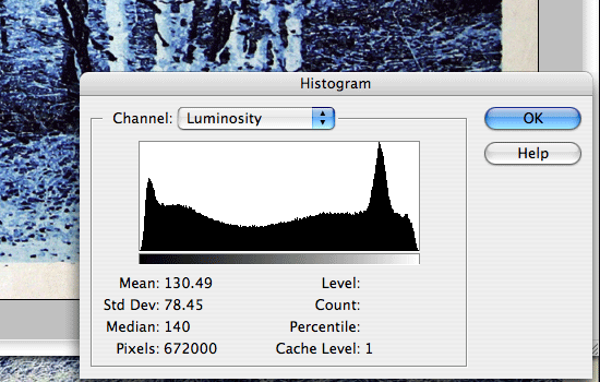
Beta block: for my taste, you've got the blank block way too deep, losing the silvery colour of the tree bark. And Photoshop backs me up on this. Here are two histograms, one from your proof1 (on the right), and one from the 'master' you sent me originally (on the left). The master shows a mostly smooth path from darks to lights (with a strange spike near the light end), but yours shows a sudden drop-off suddenly cutting in at the light end, indicating that there are no 'whites' present in your image. Yours also shows fat 'bumps' in the curve, so I think the gradation percentages you have used can be adjusted to good effect.
If I fiddle with your proof a bit in Photoshop, I can smooth that a tad, and put some silver back on the trunks ... (yours on the left, fiddled on the right)
Tone breakdown: seeing your printout of the 'steps' of tonal gradation, makes me realize that next time, this kind of thing should be carved into the blocks, spaced far enough away to be trimmed off after printing. That would make both proofing and subsequent printings so much easier ...
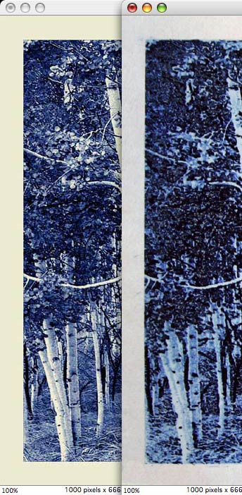
Carving detail: pretty damn close! Have you put them side by side? I'll attach a clip ... two images sized to match - your master, and this newest proof. The darkest blacks have 'expanded' a fraction, so overall we won't have the exquisite detail of the original, but this is 'not bad ... not bad ...' I think though, that this shows the 'loss' of the silvery white quite clearly. I think these blocks just need to be printed - from light to dark - with a bit of a 'lighter' hand ...
More later as I think of it ... Get me those blocks!
From: Mike | Date: May 8, 2006
... nervous about using mixed woods for the print.
First, I imagine given your histogram comments (farther down), that you
won't be using block 0 anyway -- but if you do, it isn't going to be a
problem -- I didn't have enough of the cherry for a 5th block, so included
the maple blank from a previous attempt in the event you decided you wanted
to use it -- registration is NOT going to be a problem in this print,
especially for this block 0, but you KNOW I wouldn't 'normally' mix woods in
a block set, right?
the cherry is a laminate? (or whatever you call that stuff made up|from thinner strips ...)
Well, we did discuss this -- I was unable to find (ANYwhere -- even
contacted several large mail-order suppliers without success) a single plank
wide enough for the blocks, so I used a glued-up plank -- a number of 2 to 3
inch wide planks glued up to make a single board wide enough to cut the
blocks -- I believe it'll be just fine -- there is no sapwood in the stuff
so it ought to behave as well as (maybe better, as it may tend to resist
overall warping) a plank. Honestly, I believe it'll be OK, but there's
always a chance that something could 'go wrong' -- but plank can also go
wrong (severe warping or cracking possible) -- I just don't believe that
this will be a problem... I'll keep an eye out for wide stock for future
projects, though.
I don't believe you'll be able to perceive ANY variation in the prints at
all, though -- I tried to select a homogenous glued-up plank and I think
it'll print exactly as you'd expect with a normal plank. This glue up is a
commercial one -- I didn't assemble and glue them up myself -- it came that
way from the lumber yard (they sell this stuff side-by-side with solid
planks undifferentiated and priced the same). Buyer beware -- sometimes
it's hard to tell at first glance that you're looking at a laminated plank!
I screwed the plank down to my machine bed and then 'planed' the surface on
my machine using a 1 1/4" diameter planning bit and making .3" passes in
order to get it very flat (relative to the machine plane), then sanded with
100, 150, 220, 400 grits to a high polish before carving. Then flipped it,
screwed it back down, planed the other side, sanded and carved for the even
numbered blocks.
Block 2 is the flip side of block 1, block 4 is the flip side of block 3,
etc.
The grain match of the boards in the glue-up appears NOT to have been done
the way you or I might have arranged it -- I'd have alternated
convex/concave/convex/etc in order to minimize warping in blocks or
furniture, but these appear to have been laid out without regard to growth
ring direction -- nonetheless, I don't believe that these will warp and I
don't believe that the joints will be at all visible in the prints. Let me
know if that turns out not to be the case (I'm sure you will) :-)
And that leads to the idea of producing this print in both versions - daytime/nightime ... It's going to be worth experimenting with.
Romantic thought -- I hadn't considered a Yoshida Hiroshi style day/night
handling (I would never consider such an approach on my own) but SURE --
give it a try if you are able! I do think this would be effective in
graphite (silvery gray pigment + sumi)... Duotone -- I've done several
"duotone" editions, but usually using contrasting colors -- red and green or
blue and red -- these make a somewhat psychedelic color effect and make it
less obvious how the print was accomplished -- but I don't imagine that
approach will enhance this image at all!
The Aspen Grove
'could' go from green to blue to black, I suppose (or for more punch, from
green to red to black) -- have to experiment to see whether this is dramatic
-- but I see the image as quiet and only slightly menacing, so probably
better more or less monochromatic...
|- block 0. For my taste, you've got this one _way_ too deep
You'll get no argument from me on this point at all -- I agree -- solution
is to leave block 0 out of it which is very easy, of course!
- gradation sample. Seeing this makes me realize that next time, this should be carved in the block, spaced just far enough away to be trimmed off after printing. That would make subsequent printings _so much_ easier ...
Well, this is going to be even easier than you imagine, as the blocks have
an outer lip all the way around which could easily be carved to produce such
a 'scale' on the left and right (one side with individual colors and the
other with overlapped colors -- it'll remove some of the outer baren
support, of course, but might be worth it -- I'll leave this task to you, I
guess -- you can decide after you receive the blocks. VERY easy job,
actually.
carving detail. Pretty damn close! Have you put them side by side?
No, I NEVER do that! It's always so disappointing to see the huge loss from
hundreds of colors to only (in this instance) 8! But your side-by-side
image is interesting in that the gross print holds up 'fairly' well against
the photographic original, I suppose -- but the original is so much nicer!
More later as I think of it ... Get me those blocks!
I'll get started packing them up for you this morning and get them into
Monday's mail
From: Dave | Date: May 8, 2006
Duotone -- I've done several "duotone" editions, but usually using contrasting colors
I think a Duotone is perfect for what we want here. I don't mean 'duotone' in the sense of a 'two-colour print', but in the 'official' sense of a Duotone: "allocate a different colour to specific part of the tonal range".
With our print already 'separated' into tones, experimenting with this should be easy. For a Silvery-grey ghostly appearance, using a cyan in with the greys at the appropriate level should provide a very interesting effect.
Just did a quick-'n-dirty Google on this, and here's a page that shows the kind of thing I mean - a colour photo turned into a Duotone, ending up with a good 'silvery' feel; click the 'finished' photo on that page to enlarge it and see the effect ...
Well, this is going to be even easier than you imagine, as the blocks have an outer lip all the way around which could easily be carved to produce such a 'scale' on the left and right
Hmm ... after I saw your images I had one thought ... "Soon as I get that package, I'll get those blocks down to my bench, get out my nice broad chisel, and get rid of all that stuff around the edges." And in fact, when I prepared your block images for the website yesterday, I 'trimmed' them at just that place!
But yes, while proofing that'll be a good idea - use that area to print a 'scale'. But when it's time to print for real, they'll have to come off!
This thread continues in Aspen Grove (5) ...
Add Your Input