« Hokkei Dragon (3) - Tracing done ... | Front Page | Visit to printer Shinkichi Numabe »
Aspen Grove (6) - In a blue study ...
Posted by Dave Bull on May 25, 2006 [Permalink]
Continued from Aspen Grove (5) | Starting point of the thread is here
Time for some more work on the Aspen Grove proofing. But first, a small side journey. Mike has been describing his prints as being made with 'ai' (indigo), in the tradition of 'ai-zuri' prints from the old days. This was a kind of sub-genre in which the entire print (or most of it, anyway) was done using just that pigment, giving a sort of ghostly effect.
But when I look at his prints, the blue I see there doesn't match what I have here in my pigment drawer labelled 'ai', and I thought it was time to sit down and try to figure out what he used as a starting point for his proofs. (And not coincidentally, to also try and sort out for myself just how some of these pigments compare with each other, the kind of thing that I haven't spent anywhere near as much time doing as I should have!)
Let's look at the stuff that I currently have in my 'arsenal':

These are mostly from Matsuyoshi Pigments, one of Tokyo's most respected suppliers of colourants to printmakers, painters, and people in the textile business.
I say 'respected', but honestly speaking, the place is nothing like it was, even 20-odd years ago when I first went there. Mr. Matsuyoshi is long gone, and the current managers - not by any fault of their own - no longer have access to the sort of pigments that were still quite commonly available then. (Things aren't completely bleak though; there is strong demand from workers in the textile trades for 'authentic' dyes and pigments, and this is promoting a lot of research into traditional colourants ...)
The six various 'blue' pigments I have are:
- 1) hon-ai - 'hon' translates as 'real', but in this case, that's a lie. When I bought this, I thought it didn't quite look like 'real' indigo, and when I queried the people in the pigment shop, they agreed, saying something like "Yes, you're right. This is a factory-made pigment. 'hon-ai' is the name of the colour, not any indication of what it is actually made from."
- 2) indo-ai - 'indo' is of course 'India', and this is imported from there. It looks much closer to what I understand as 'real' indigo, and I think that this is indeed extracted from the plants.
- 3) hana-ai - 'hana' is flower, but again, as with the first of these six pigments, this is just a label, not an indication of source. This too, has every appearance of being a factory pigment. (More about this one below)
- 4) kin-bero - also called 'bero-ai', bero being an attempt at the word 'Berlin' (or so the colour encyclopedias tell us). This pigment comes in good large chunks, and has gold coloured flecks and reflectance all over it.
- 5) Prussian blue - or 'purashan booroo' as it comes out in Japanese. A very fine powder. Interesting that this product is considered to be the same substance as #4 above, but look at the difference in the colour that has 'rubbed' onto the inside of the package ...
- 6) (name unknown) - (not in the photo above) a powdered pigment in a bottle marked 'Grumbacher' that I found at the back of my pigment cupboard. [Is this maybe what is known as 'ultramarine' in the west? If somebody can let me know, I'll update this page accordingly ...]
For eighteen years, I have used these pigments - and none others - for the blue (and mixes) on my prints. (The western pigment was used only once - for a mix to produce the sky on this print.)
Taking photographs of a pile of dark powder is not the easiest thing to do, and some of these differences are not going to be easy to see. So I have created quite large versions of these little images (in the popup), to try and let you see the details of the pigment texture, etc. Here they are, in the same order as I just listed them:
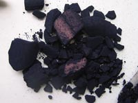 |  |
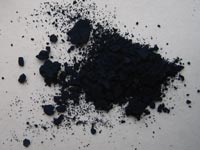 |  |
 | 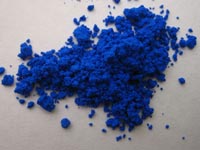 |
Now, that's all very interesting, but doesn't help us see the colour that they produce. Let me do some 'finger painting' on each one, just dipping my finger in water and rubbing a bit of the stuff around ...
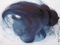 |  |
 |  |
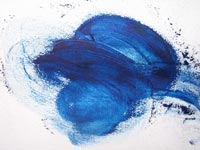 |  |
The first two are very similar. The factory that made the first one did come very close to a reproduction of the natural plant pigment. (What will happen over time I have no idea, although I would perhaps expect that the natural one would fade more readily ...)
#4 and 5 are also similar, which is to be expected, as they are supposed to be the same thing, just in slightly different form - heavy lumps as opposed to finely ground. I have no idea at all how these are made. When I need a 'Hiroshige' water colour, I use #4 ...
#3 is interesting as - something I hadn't realized before - it seems to be a kind of blend of the indigo and the Prussian Blue. The wall cabinets of the Matsuyoshi pigment shop are jammed with rows and rows of bottles of such colours. I have written about this over in my Encyclopedia, how traditional printmakers do not generally use such pre-blended pigment mixes, usually preferring to make up their own colour from a small palette of 'base' colours.
Now, getting back to our proofing work on Mike's print, let's look at an enlargement of his proof, and try to figure out what he used to make it. The darker shades here have a lot of sumi blended in, so won't stand a direct comparison with the samples shown above, but I think at the 'thinner' levels of blue, he perhaps used his pigment pretty much 'straight'.
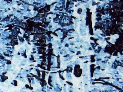
Well, what do you think? I don't think his pigment has the 'darkish' feel of the indigo, nor does it have the outright 'blueishness' that the Prussians have. If any of these, it looks perhaps quite similar to a light application of #3 ... with the 'icy' feeling apparent in the thinnest parts. But it certainly doesn't have the 'greenish' tone that comes with the buildup of #3.
Let's try looking at it a different way. To try and reduce the effect of the different paper and lighting, if we look at a print at a sharp angle, we can get an interesting view of the overall 'tones'. This is the same print, under the same light, with the same camera settings! Look at how 'green' it has become!

And then, if I lay some of those smeared samples on top of it one by one (still in the same order) we can see which ones feel right:
I think I'll clearly 'vote' for the third one ... although seen this way, it does indeed seem that Mike's pigment is clearly of the 'ai' type, and doesn't lean much to the 'Prussian' side of things ...
But there is yet one more aspect to this comparison that we are ignoring - the paper. It's actually impossible to make a fair comparison of pigments that are on different types of paper, as these test swatches are.
Down in the workshop now, with the beta block that forms the base layer of Mike's print. I've brushed some light pigment over it, although because that is so transparent, it's completely impossible just looking at the wood to see how much we have there. We have to take a test strip first:

... and then lay it down for comparison ...

Not even close, right? But the paper I used for that was just a strip of white copy paper. Let's try it again - exactly the same brushwork - but this time with a strip of washi trimmed from a previous printing job:

... and lay it down ...

Still not exactly the same shade/tone/tint that Mike used, but certainly in the ballpark. This question of how colours change depending on the underlying paper is so important in this tradition. Because the pigment applications are so transparent, it's completely impossible to tell what you are going to get just by looking at the pigment in a bowl, smeared on a test strip, or printed onto the wrong kind of paper. Here are those two strips side-by-side ... exactly the same pigment, at the same concentration:

So anyway, enought talking ... now that I've got these a bit more clearly understood in my head, let's make a print with this stuff ... #3 from the above list. I've drilled the blocks to take some 'hold-down' screws to keep the warping under control, have just made some washi moist, and will start another run tonight. I'll have to interrupt that in the morning, because tomorrow I have an appointment downtown with Numabe-san the printer, to deliver the Hilo Bay blocks and paper, and to have a good long discussion about what we need on that one ... if I can still remember!
This thread continues in Aspen Grove (7) ...
Added by: Barbara on May 27, 2006, 12:12 am
Dave,
I do think the color is Ultamarine blue for #6. At least it looks like it on my computer.
The color Mike used almost seems to have a thallo quality to it....I have an ink that is really close to this in my oil based inks and it is called "thallo peacock". It is from Graphic Chemical. Of course the computer can change things so what I am seeing might not be what you are seeing. At any rate, I have perfect confidence you will be able to figure this out one way or the other!
Barbara

Added by: Mike Lyon on May 27, 2006, 12:29 am
Dear Dave,
I've been using several "Prussian Blue" pigments from several suppliers -- plus several blacks: sumi, neri-zumi, and "Channel Black". All are similar, but different... Your photo of #3 appears closest to the Prussian Blues I use which all have a similar somewhat cyanic (slightly greenish) tint... There's an interesting page with manufacturing instructions at PRUSSIAN RECIPE and the photo of the dried pigment appears remarkably similar to your photo of #5...
In the bag, my Prussian Blue dry pigment (Daniel Smith 5 lb. bag) has a very beautiful and intense, extremely deep and dark, reddish blue appearance similar to azurite. But when rubbed onto paper it appears more like #3 than like #5 -- I spilled a tablespoon of it on the floor in Colorado while cleaning up after teaching a workshop, and by the time I got it 'cleaned up', the entire studio floor had that beautiful tint :-).
Your #6, by the way, looks more like cobalt to me -- it's a color I don't much appreciate.
I think that if you use a commercial Prussian Blue, you'll get color similar to mine. I don't have ANY experience with #3, hana-ai, but if all I had to choose from were your color swatch photos, that's the one I'd use... Check permanence first, please, as 'genuine' hana was quite fugitive, I seem to recall...
Look forward to seeing the next proof!
-- Mike

Added by: Mike Lyon on May 27, 2006, 12:32 am
Oh -- one more thing -- the proof I sent you was made with pigment suspensions from Guerra Paint and Pigment in New York City -- Prussian Blue and Channel Black, no paste at all, only pigment suspensions and water...
-- Mike

Add Your Input