« Aspen Grove (9) - 4th Set of Blocks arrive! | Front Page | Aspen Grove (11) - Embossing the title »
Aspen Grove (10) - Proofing
Posted by Dave Bull on November 9, 2006 [Permalink]
Continued from Aspen Grove (9) | Starting point of the thread is here
Sorry for the lack of updates recently ... just so much going on here these days! :-(
I snatched a chance to get away from my own workbench the other day, to drop in on Numabe-san to see how his proofing had come along. I found him working on an edition for a contemporary 'printmaker' (you know why I put that word in quotation marks!), but he had some stuff to show me. Given all the problems we have had with these block sets, I tried to simplify our work a bit and told him to focus on just getting a good clean print from these new blocks - using Mike's print as a target. We'll worry about alternate versions, etc. later ...
Here's a shot of his most recent proof, on the table beside Mike's original print:
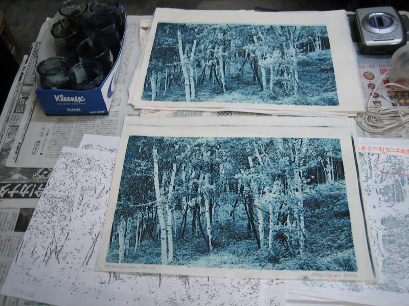
He has come very close - he said the blocks gave him no problems at all ... stable, flat, and easy to work with.
He has prepared a set of pigment specimens to match the eight blocks; these are in the jars at the top left of the photo. Seems to be mostly prussian blue, with sumi added for the later stages.
If you look closely at his proof (the top picture), you can see a light blue strip along the top of the image. This is printed by block #0, the blank block in the set. For this new block set, Mike prepared blocks #1 through #8, and didn't bother to send a replacement for the blank one, knowing that we could use the one from the previous block set. But look at the difference in size! Numabe-san wanted me to see this before he cut it down to fit the new blocks.
Mike says that all the block sets have been cut to the exact same dimensions, and I guess that's so, but they sure didn't stay the same dimensions! Look at this next photo. The three prints are (from the top)
- one of my own first proofs taken from the first block set we received, made soon after the blocks arrived in Japan.
- the proof Mike pulled from those blocks in Kansas City
- a proof Numabe pulled from those same blocks, after they had been in Japan a few weeks ...
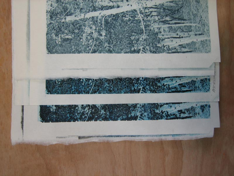
No wonder we were having so much trouble with them ... But anyway, this new set is working just fine. They are plywood core, which of course reduces expansion/contraction, and we have moved into the dryest part of the year, when blocks generally stay much more stable ...
I've given him the go-ahead to pull an edition, so finally, we're almost at the point where we can publish!

This thread continues in Aspen Grove (11) ...
Added by: Mike Lyon on November 10, 2006, 8:50 am
Dear Dave,
Great to see that proofing has gotten underway!
If Numabe-san is able to keep the visual 'steps' in value roughly equal from block to block, then I think I'd not use the blank block 0 at all and just keep the first value printed pale enough so the visual step between the DRY, unpigmented paper and the pale pigment printed by block 1 is roughly the same as the step size between each subsequent block printing... I'd ONLY use the 'blank' block 0 in the event you decide that a darker and lower contrast final image is preferable... Conceptually: block 0 allows you retain equal steps in value when printing a darker low-contrast image. So, to name four contrast 'settings' for printing:
1) greatest contrast and tonal range will be obtained by printing blocks 1-8 (not blank block 0) in visually equal 'steps' from palest blue of block 1 to deepest blue/black of block 8.
2) pale low contrast image obtained by omitting block 0 and making smaller steps between blocks so darkest values in print wind up in mid-range somewhere.
3) using block 0, begin somewhere in mid-range and making very small but equal value steps between blocks, finish block 8 somewhere deeper in mid-range.
4) using block 0, begin somewhere in mid-range and making small but equal steps, finish block 8 at deepest blue/black.
Each of these approaches should provoke a slightly different emotion when they're viewed -- #1 will be most crisply technical -- #4 will be most eerie...
If I had to request only ONE version, sight unseen, then I'd ask for #1 -- full range of values, and visually equal as possible steps in value from block to block. That will make the cleanest image.
If the tonal jumps were distracting, then I'd make them less so by incorporating block #0 -- but I'd still try to print equal steps and wind up at the deepest velvety blue/black I was able to produce by the time I printed block #8.
Best (and GOOD LUCK)!,
Mike

Add Your Input