« Busyness! | Front Page | Case by Case ... »
Roadmap ...
Posted by Dave Bull on September 22, 2013 [Permalink]
I mentioned in yesterday's post that I was carving the final Ukiyoe Heroes print in the batch that were decided during last year's Kickstarter campaign - the one Jed calls 'I Choose You', based on an extremely popular video game series.
Since the campaign ended, he has continued to produce 'Heroes' designs, and has already put a number of them up on his webshop as giclées, as he doesn't need my cooperation to get them out to his fans in that format. But there is of course plenty of interest from people in having more woodblock prints made, so he and I have batted around how we should take the series forward from here.
One idea was to set up another Kickstarter campaign, and 'do it all over again', this time with the new designs, but that really doesn't seem suitable. For one, Jed has just done another campaign over there - for his Edo Superstar video game - and to be honest, we no longer need 'kickstarting' for these prints, as we have a production system set up, and we know that there is demand for them.
Our decision simply comes down to which ones we think will sell in woodblock format, and that we can thus justify investing the time/money to actually make them. If I were to make another Heroes print, but then find that it only sold a few dozen copies, I would be out of pocket for my time and expenses.
After kicking it around for a while, we decided just to make our own decisions, and to take the risk of putting some of these into production even without a ton of advance orders. So here's the schedule for the next few months - here are the upcoming designs which are now available for purchase on Jed's shop. I hope enough of you will prove we have selected wisely!
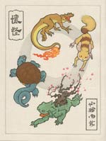
| I Choose You! |
|
| Carving in September, printing through October (Pre-order from Jed's website here) |
| Trouble Afoot |
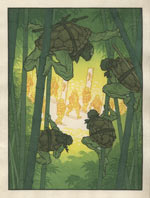 |
| Carving in November, printing through December (Pre-order from Jed's website here) |
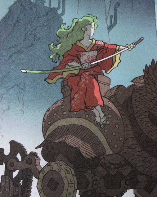
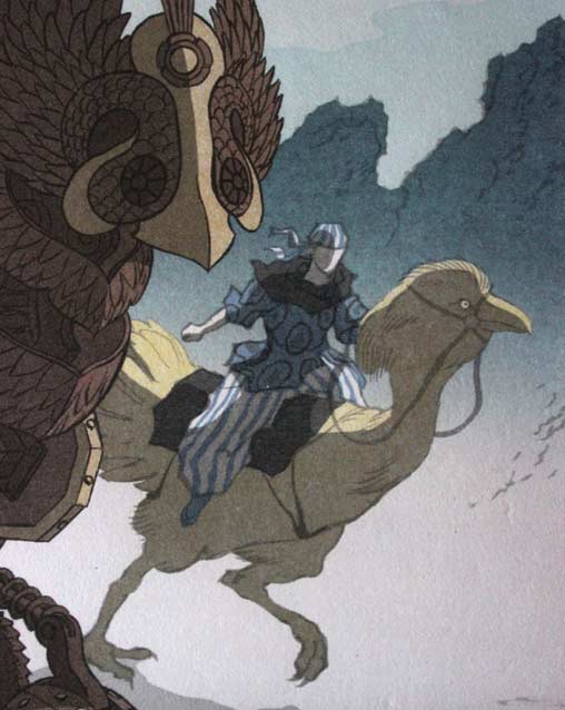
| Flight of Fantasy |
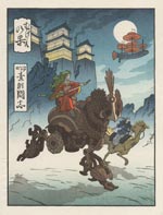 |
| Carving in January, printing through February (Pre-order from Jed's website here) |
| Blue Storm |
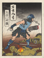 |
| Carving in March, printing through April (Pre-order from Jed's website here) |
These all look like fun, and some of them are going to take us in directions we haven't really explored together yet. Have a look at these two closeups of the "Flight of Fantasy' image!
I can't wait to get started on these!
Added by: Daniel on September 27, 2013, 1:43 pm
I was really excited when I saw on the Facebook page that these were coming out and have already spoken to Jed about picking up all three. I was curious on what would happen as things progressed past the original set. I have been thinking about how to create / store my prints recently as I really want something similar to those you have available for your collections.
Also, if you are taking suggestions, if it is not too complex of an image. I really love Jed's recent design Origin Story.

Added by: Dave on September 27, 2013, 2:00 pm
The Origin Story is definitely on the 'to do if we can manage it' list. As you can guess, the question is the amount of detail ... It would certainly work as a larger 'o-ban' print, but whether or not we can make it work at the smaller size is far from clear ...
He and I also have different ideas on how to handle the foreground town scene. He feels it should be empty, but I'm thinking there should be panicking crowds running here and there to escape ...
Added by: Daniel on September 28, 2013, 2:15 am
Sorry for the grammatical errors in the previous post. That is probably why I shouldn't respond to things on a mobile device right before going to bed.
Anyway, I am really excited that you are thinking about Origin Story. The image is extremely detailed, so I agree that it may need to have some changes or be of a larger size, either of which I am sure will be of the top quality.
I guess as far as the foreground is concerned it really comes down to how the image blends between the game and the ukioye style. The images in the game are fairly peaceful and the characters are cute, but the idea that the prince is recreating the stars and moons that his father accidentally destroyed by using a magically adhesive ball to pick up larger and larger objects until that ball is large enough to become a new star does have some unsettling undertones.
It is that interesting duality of nature that from destruction comes rebirth that is so captivating about this image. In "destroying" these objects the prince is simply creating new opportunities and life. So it become a question of how this duality should be expressed. Does the cuteness of the image contrast with the actual destruction that is going on, or does the image become darker (showing people in terror) lay on top of the idea that the prince is really creating new worlds. Or, should there be multiple layers, where the image remains cute, but also have similarly illustrated individuals in terror?
Add Your Input