« Senshafuda Project - Ain't we got fun! (Part 2) | Front Page | Today's results ... »
Senshafuda - Summer 2011 : Let's get going!
Posted by Dave Bull on June 26, 2011 [Permalink]
There is so much going on here just now, I don't know where to start with the updates ... Anyway, let's get this one done first!
Given that I want the Senshafuda prints to be published on a 3-month schedule - basically aligned with the seasons - one would expect that a 3-month 'start to finish' production period would suffice. Well it will, in theory, but we're still so new at this, and our production methods still so unsteady, that the only 'schedule' being considered at present is simply: keep moving forward, and hope we'll get it done 'in time'.
And 'in time' we're not. Here we are now in hot summer in Tokyo, and the next set of three is still on the drawing board!
Well, what can I say ... perhaps the 'hot' prints will help keep you warm in the chilly autumn air! ![]()
The production of each set of senshafuda always starts off the same way, with Seki-san and I chatting about possible ideas for the three, and she then goes off and begins sketching.
When I met her a few weeks back, she showed me some (very rough) pencil sketches - nothing more than scribbles really - for the first stab at it. She didn't leave them with me, so I can't show you here, but I can post the ones she sent a week or so later, still in very rough form, but fleshed out a bit more.
Before we look at them, remember the 'remit' that I have given her. The three designs in each set will include:
- one strongly seasonal (although all three will certainly be related to the season)
- one based on traditional Japanese culture
- something based on contemporary life here in Japan
We saw this in the Spring set with 'Full Bloom', 'Doll Festival' and 'Sky Tree' respectively.
Here is the first batch (12 images) that arrived in my inbox a couple of weeks ago:
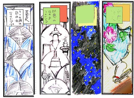

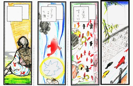
Some are self-evident, some may need a bit of elucidation. The cockerel you see is a decoration on a festival cart; two of the scenes with goldfish represent the summer festival children's activity of 'scooping goldfish'. The scenes of tall buildings are an international 'light up' festival that Seki-san had heard of. The one in dark blue/black is intended to be seen as though by person lying on the ground looking up into the trees, where fireflies are flitting around ...
I think we have material here suitable to be worked into our 'Season' and 'Tradition' spots, but nothing for the 'Contemporary' scene. A 'light up' festival isn't what Japan is into just now, and her design - with the tall towers - looks like a retread of our SkyTree image!
I gave her my comments, and nearly two weeks later (!) she sent over this:
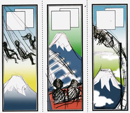
It's a scene from a famous theme park located not too far from Mt. Fuji (as you can see). I sat and looked at these for a while, but didn't find that I was very excited about this. I think the concept itself is not so bad, but her realizations of it - even at this clumsy conceptual stage - just don't set me on fire.
But I was a bit hesitant to be 'negative' about what she was doing, and being pretty occupied with a lot of other jobs here, I postponed calling her ...
It seems she 'got the message' though, so she had another go:
Whoopee! This we can do something with! It's summery, it's modern, it's colourful, and it makes fabulous use of our vertical format!
So that's where we sit at the moment. It's the weekend now (my only real chance to speak to her, as her normal day job keeps her pretty well occupied during the week), so she and I will hopefully be nailing down the selection of three sometime today or tomorrow.
I have a pretty clear view now of what the set might look like, but it would certainly be interesting to hear from the viewers too. If you were the series 'editor', what would your decision be at this point?
Added by: Albert A on June 26, 2011, 9:50 am
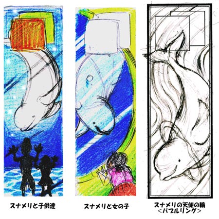
I think the hanabi has potential, but that sketch doesn't particularly set me on fire, so to speak. The festival cockerel looks like it could be a great and colorful print. Also, it's nice if they're not all quite so literal. The woman behind the screen (bottom left) really catches my eye, and the middle beluga print has lovely composition and more depth than the other two.

Added by: AEleen Frisch on June 27, 2011, 12:24 am
There's no accounting for taste of course, but while I like the central Beluga one, I think the amusement park is more modern. I love all three of those, especially the right one. So, I would pick: Traditional: woman in kimono back view (bottom row left of first group); Seasonal: I love the cat (front facing) and the goldfish. If a child could be worked in as well, this might work for seasonal; Modern: loop rollercoaster plus Mt. Fuji.
Added by: Sharri on June 27, 2011, 3:17 am
My choices would be: the woman in the kimono, the front facing cat and the gold fish, the center Fuji/roller coaster. I like the anticipation in the latter image. But, I also like the cockerel and the center dolphin. So, there you go - an editor I am not. ;-)
Added by: Tom Kristensen on June 28, 2011, 11:51 am
I think whales belong out in the ocean.
Add Your Input