« Hokusai Turtles | Front Page | Echizen Washi by Iwano Ichibei »
Plum Blossoms in Moonlight
Posted by Dave Bull on May 6, 2006 [Permalink]
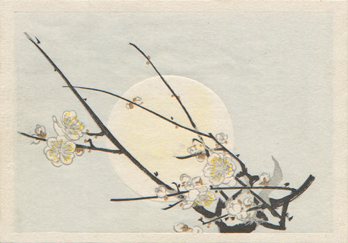
This is a slightly 'clipped' reproduction of one of the pages from the book Favourite Flowers of Japan, published in Tokyo in 1901. It was illustrated by kuchi-e artist Mishima Shoso, and had text written by the wife of the owner of a plant nursery in Yokohama, who apparently sponsored its production to help promote his business. Each page of the book went through two completely separate printing processes: the text was done first on a modern letterpress, and the printed sheets (high quality Japanese hosho paper) were then sent to traditional printers to add the illustrations.
I selected it for the Mokuhankan catalogue as an experiment. The original book itself is printed in a style so delicate as to be scarcely believeable - the tints are so faint that it is sometimes difficult to tell if there is actually any pigment on the page or not. This is not because my copy has faded; it is just the way that top-level Meiji-era printing could be done.
I wanted to try this, so after the blocks were done, as I sat at my workbench preparing the first proof copies of this design, I put just the barest dab of pigment onto each brush ... for the pale sky and the tint on the face of the moon. I dried and inspected a couple of sheets ... nope, nothing visible at all. So I tried a few more copies, using slightly more pigment ... nope, not yet. On my third attempt, my test printing seemed to be close to the original - you could see colour if you held the sheet 'just so'. I ran off a few more copies.
Next step was scanning for this catalogue. I have such a good scanner though - it wants to 'help' me, tries to pick up every trace of colour that it sees, and gave me this image, with a solid blue sky and a 'bright' yellow moon! Now actually, the colours in the print are nowhere near this 'deep', but if I try and reduce them in Photoshop, things just get all mixed up and the whole thing looks worse, so I have left it as an untouched scan.
The print - seen when held in the hand in natural light near a window - looks wonderfully delicate. I realize that this isn't to everybody's taste. Most woodblock prints made here in Japan these days have quite saturated colour; printers tell me that 'that's what the customers want'. I'm not so sure that's true and I suspect that this is just the 'modern way'. I think there are people out there who would accept a quieter viewpoint. But now I'm starting to sound pretentious - "Only a few people are sensitive enough to appreciate ... blah blah ..." - so I think I'll just leave it there. This is indeed, a very quiet print; I hope some people find it to their liking.
Click here to see a larger image of the print.
The catalogue entry for this print.
Add Your Input