« Aspen Grove [3] - Block Cutting | Front Page | General Update ... »
Hilo Bay (11) - Third Proof
Posted by Dave Bull on April 23, 2006 [Permalink]
Continued from Hilo Bay [10] | Starting point of the thread is here
Not sure if I should wait until daylight before taking a photo of this one ... but what the hey, let's do both; I'll take a quick snapshot at my desk now, and then shoot it properly in the morning, as I did with the second proof yesterday.
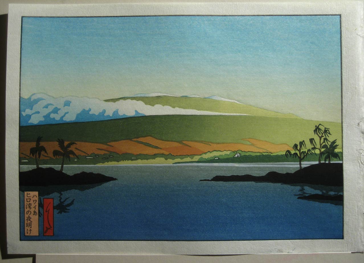
Improvements:
- better sky colour; letting more paper white show through gets it closer to the master copy
- clouds now much closer - I had been too 'delicate' before ...
- higher mountains now visible catching more light than the lower regions
- sea colour much better; I took out the undercoat of green in the area this side of the islands. This is much more difficult to print - to match the green and blue gradations - but no question it's a better result ...
- building roofs at the left are now catching sunlight (except one that is still causing trouble somehow ..)
Still not so good:
- that open earth area still resists 'finding' the right reddish colour ...
- islands are still missing the red/purple tone along the top edge
I'm having trouble with my red pigment. I've had this happen before; the impression looks fine down there at the bench, but once the sheet is dried and pressed ... "Where did it go?" I'm not blaming the pigment itself ... I'm the one holding the baren ... but either I've got to replace it, or figure out how to use it properly ...
Anyway, that's where it's going to sit for a while. As I mentioned, it's back to work on the scroll from tomorrow morning (after getting the (late) spring newsletter printed). There is a Craftsmens' Association dinner on Wednesday night down in Tokyo; that should provide a good opportunity to scout out some possibilities for getting this thing printed ...

The thread continues in Hilo Bay [12] ...
Added by: Gary on April 24, 2006, 12:12 am
This is much better. What I think this needs now is more 'glow' on the sunnyside of the mountain, perhaps putting a bit more richer yellow in the green, so it is not so wan or pale at the right.
The bare earth section does not bother me as much, perhaps a drop or two of red or magenta in your brown pigment on the darker end of the gradation would do it, hard to tell in this photo.
Also the light tree line at the water's edge could be a richer yellow/green.
The rest is looking good from what I can see here. Water is good, sky is good, clouds much better.
Title cartouche needs a bit more pizzazz. You had it much closer in your earlier proof. It need not be the potent coloring of my digital print, as you said you didn't have that strong of pigment, but something in the rich yet soft pink should also bring out some of the print's colors a little better. One color affects the others.
But much more of the 'atmosphere' of the print is coming through here, you have further lifted the haze and it is starting to become clear. You are not far from having it right on!

Added by: Gary on April 24, 2006, 12:15 am
P.S. If and when you have the time, I think it'd be neat to line up all of your proofs, from #1 forward, to show the viewer your progression as you seek to achieve the ultimate effects of the print and the stages you have been to, to get there.
Added by: Jacques on April 24, 2006, 12:37 am
Well done Dave, congratulations!
I like the deep blue of the sea in the foreground and the stronger blue in the clouds. Everything now combines to make the morning light coming in really nicely focussed from the right. In fact we're looking at Hilo Bay a bit earlier in the morning (with a 'lower' light) than in your original, Gary, but that's fine with me.
Solve the mystery of the 'vanishing red', and I think you have a great print there!
Added by: Dave on April 24, 2006, 10:04 am
Another nice cloudy day today ... exactly the same conditions for taking a photo ...
Here's the third proof, together with Gary's printout:
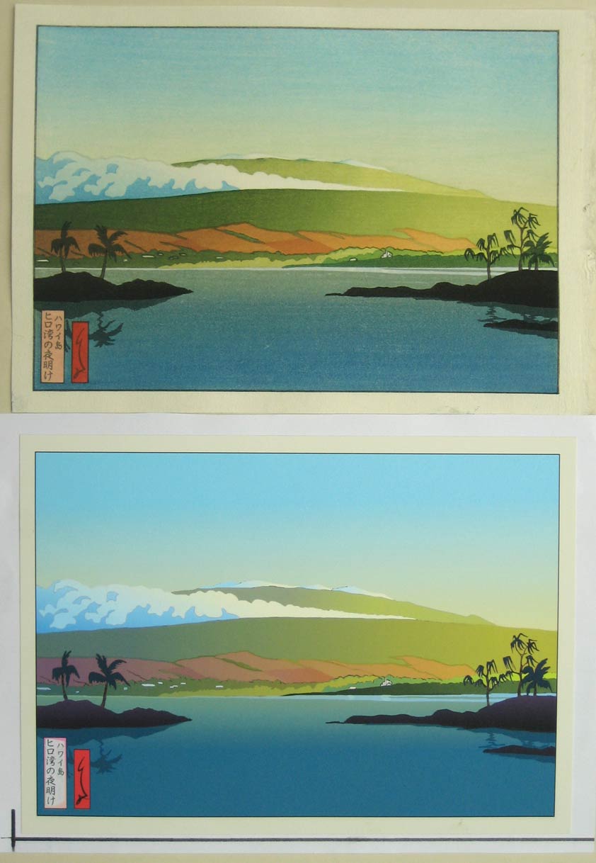
We are now certainly close enough to send this off to a printer. When I do, I of course will give him the list of things that have yet to be done, and it'll then be his turn to pick it up from there, building on what I've done so far.
If he's good, he should be able to take it the rest of the way with his first proof; if so, it'll be time to put the order in. I can only afford to order a few dozen (which he isn't going to be very happy with!), but that will at least get this show on the road!
Added by: Dave on April 24, 2006, 10:16 am
If and when you have the time, I think it'd be neat to line up all of your proofs, from #1 forward, to show the viewer your progression as you seek to achieve the ultimate effects of the print and the stages you have been to, to get there.
Here you go ...
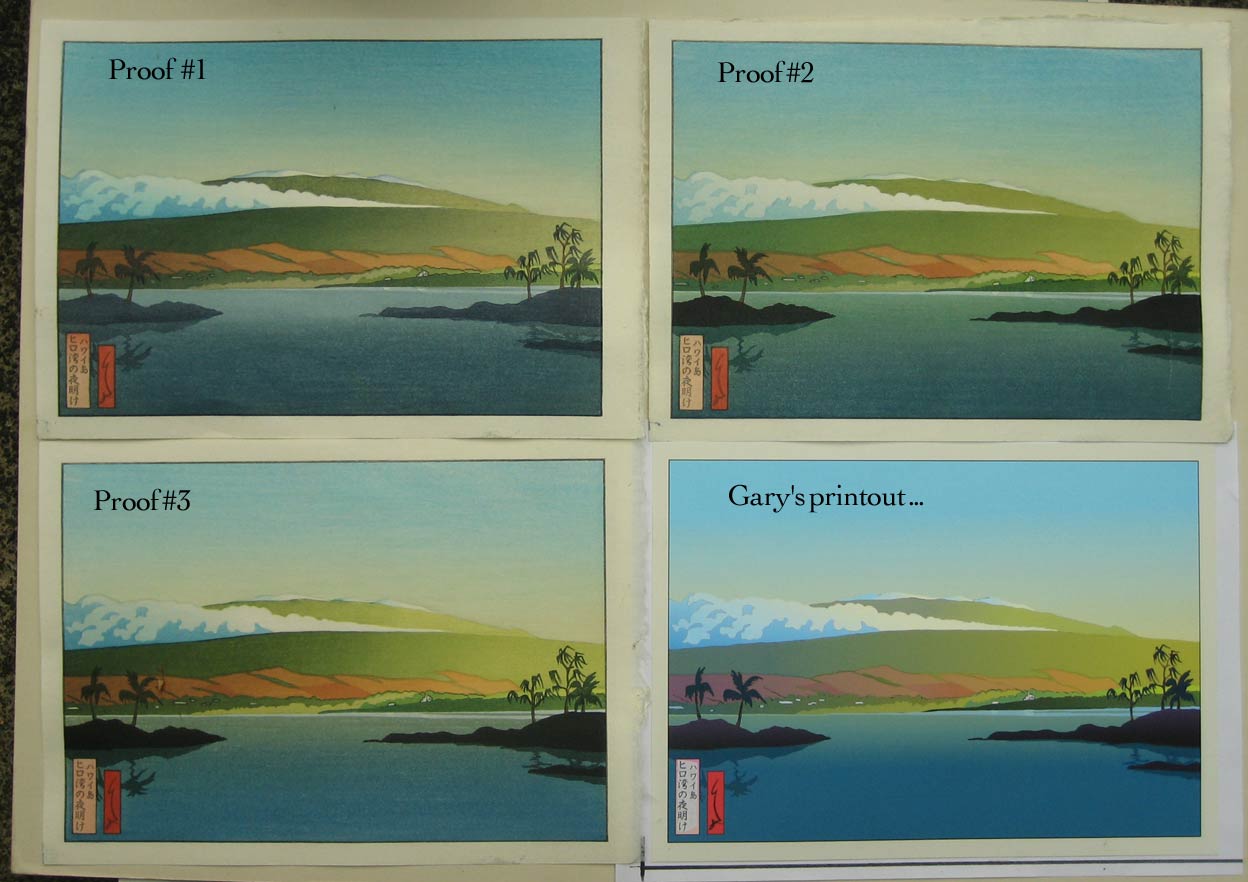
Added by: Gary on April 24, 2006, 10:23 pm
Several things. The image of my digital print apprears lighter in value, which I attribute to either the lighting you used to photograph it, or a difference in my monitor's representation from yours. Are then the proofs you have lined up also a bit lighter in value than the actual prints you have done? If so, you may be closer to having it done than it appears to me.
The lower water gradation 'appears' to need just a bit deeper gradation (darker) at the bottom end from what I am seeing here. A note to the future printer.
Of course without seeing the actual proof itself, it is going to be difficult to guage on the computer whether it has hit the mark or not.
Added by: Dave on April 24, 2006, 10:39 pm
The image of my digital print appears lighter in value, which I attribute to either the lighting you used to photograph it, or a difference in my monitor's representation from yours. Are then the proofs you have lined up also a bit lighter in value than the actual prints you have done?
Not sure how to answer. The images I see on my monitor are extremely close to the actual sheets of paper sitting here on the desk.
But we're of course running into that insolvable problem of seeing these things two ways - on the monitor the images are produced by glowing phosphors emitting light, and thus they look 'bright and glowy', but the sheets of paper are being viewed by reflected light, and are thus 'duller' (both the prints and your printout)
If you are seeing a big difference in your own printout from the copy you may have sitting on your desk, then that can only be a difference in our monitor settings ...
**********
Looking over the four images there, I'm less happy with the third proof than I was yesterday. I think it's a couple of steps forward, but also a couple of steps backward.
The mountainside left/right gradation on Proof#3 is too abrupt in the centre; that on Proof#2 much more closely matches the master.
Gary talks about 'lifting the haze', but I think Proof#2 is closer to the hazy effect that we see on the mountainside in the original version; my Proof#3 is too 'clear' there.
When I talk to the printer, I'm obviously going to have to describe it to him in terms of 'cut and paste' from these multiple versions.
Title cartouche needs a bit more pizzazz.
Actually, I didn't even try to put a colour there this time - just left it with the base tone. I'll give him the master to follow ...
Added by: Gary on April 26, 2006, 2:15 am
My copy of 'Hilo Bay' here in my studio is more akin to your proof #3. The digital print of mine you display looks too washed out, and I prefer your proof #3, with its greater contrast. I think a bit deeper gradation of the blue sea in the foreground would just about get it there, in addition to a slightly deeper sky blue. (And, of course, the cartouche) :)
Add Your Input