« Ukiyoe Heroes - more images and videos | Front Page | Ukiyoe Heroes - Rickshaw cart colour buildup (and survey!) »
Ukiyoe Heroes - slideshows
Posted by Dave Bull on July 6, 2012 [Permalink]
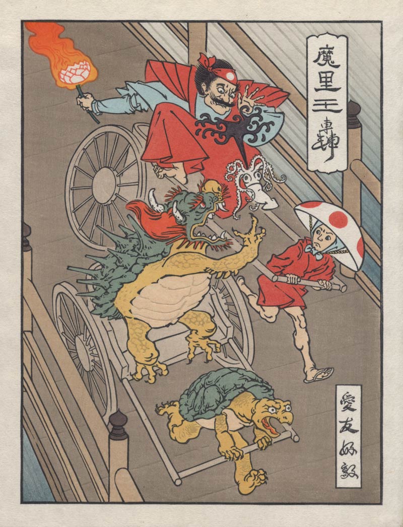
Woot! Another of our famous 'process slideshows' is up and running - see the Rickshaw Cart print come to life before your eyes ...
If you have a normal browser that understands Flash, you can jump directly to the slideshow, but if you have a tablet that doesn't play Flash, you will have to go to the Heroes page first, and start the slideshow from there.
And to put you out of your suspense right now, here's the finished image!
Added by: Tom Kristensen on July 7, 2012, 12:26 pm
Going right out on a limb here... but here goes. I'm wondering if the colour scheme on the Mario Cart is not a little too muted.
This is a question of personal taste and I do see that your scheme is perfectly balanced, but to my eye it is a touch drab. Jed's original scheme was certainly a lot brighter. I think that you guys are chasing mass appeal here and the colour values of the series needs to be pitch perfect. I feel that he scheme needs to zing a little more.

Added by: Dave on July 7, 2012, 12:48 pm
Tom, thanks for bringing this 'issue' over here for discussion.
We're wrestling with this ... how much to make ours look like a Photoshop 'bright screen' original, and how much to ignore that, and just make a 'real' woodblock.
No matter what colours I choose, I'll never get the brightness of the transmitted light from the screen version, and my personal choice here is to forget the comparison, and just make an attractive woodblock. And considering that my version will be around in hundreds of years (how long will the posters last?), I think this is the way to go ...
But there is no avoiding the comparison, and side by side, mine looks drab indeed. I brought this up with Jed-san during a Skype call just a few minutes ago, and he's not overly concerned. There will be people who 'get' the prints, and those who don't; we're not going to try to please 'all of the people all of the time' ...
Added by: Tom Kristensen on July 7, 2012, 1:04 pm
Case closed... I guess. Would be nice to see some alternate proofs though :-)
Added by: Dave on July 7, 2012, 1:10 pm
When I get a minute later this afternoon, I'll scan and post one of the test sheets - simple (non-washi) paper that sits in the stack for the first few impressions. These are for testing registration, etc. etc., and are of course tossed out at the end of the day.
But because this paper is white the resulting 'print' is actually closer to Jed's master copy.
[Update: here it is. Printing is rough; these test sheets are just for block warmup ...]
If you look at the lighter areas - belly of the beast, etc. - you will see that this is much closer to Jed's Ps image.
Added by: Tom Kristensen on July 7, 2012, 1:36 pm
Hang on, why be so demanding? I can make my own proofs on Photoshop... starts tinkering.
Added by: Dave on July 7, 2012, 1:49 pm
That reminds me! We did that sort of thing a few years back ... during the My Solitudes project. Remember this?
Maybe I should ask Jed if it's OK if we make a line drawing accessible for everybody, and let them do a 'Colour Your Own' version. I suspect he might not be all that eager, though ...
Added by: Tom Kristensen on July 7, 2012, 3:20 pm
There is a huge difference between a Photoshop scheme and a finished print and the link illustrates the point. If I remember rightly I restrained myself and waited for you to finish proofing before wading in with suggestions for changes, again wisdom with the benefit of hindsight. But Photoshop is very good for altering tones on a scan of a print, the overall feel of the print is retained while colour values can be manipulated.
I think a colouring-in book of Jed's designs would be an excellent idea. Something along these lines perhaps:
http://mokuhankan.com/catalogue/0018.html
Added by: Tom Kristensen on July 7, 2012, 3:56 pm
Okay back out on the limb... I must say that the colour values on the proof are more pleasing to me and closer to Jed's design. No chance of you switching to a brighter washi?
Added by: Dave on July 7, 2012, 4:04 pm
Tom, I think it is only more 'pleasing' on a computer monitor. When held in the hand, the two versions are night and day. The one on the white paper is raw and tasteless, the one on 'real' washi is soft and deep - and will continue to be so for a couple of hundred years!
Added by: Tom Kristensen on July 7, 2012, 4:14 pm
Yep, I hear you Dave. Nothing like judging prints off the screen. I suppose the answer is to just adjust the screen image to taste, easily done, knowing that the buyer will be more than happy with the real thing.
Added by: Marc Kahn on July 7, 2012, 10:00 pm
Hi Tom,
Long ago, Dave taught me the optimum environment in which to view a woodblock print. It's a snowy day with cloud-filtered sunlight. With all electrical lighting turned off, you get comfortable near a big single window. At this point you've got soft, diffuse light coming from a single direction. Hold the print that you are viewing horizontal so the light "rakes" the surface of the print. All of the 3-D parts of the print are then revealed by the resultant shadows. Rotate the print for the full effect of the changing shadows.
When you are looking at a print in this way, you don't want bright garish coloration. You want a subdued, balanced palate that draws you into the beauty of this object.
In my own area of focus, the shin-hanga genre of Japanese prints, there is a perfect example. The prints of Tsuchiya Koitsu, published by Doi, were originally printed by a craftsman named Yokoi, under the direction of the artist, in the 1930s. The first editions of those prints have the subdued, balanced palates that Dave is striving for. Later on, in the 1950s-70s, the printer Seki took over, under the direction of the original publisher's son, and produced some incredibly bright, garish editions from the original blocks. Presumably, the garish prints were what the public was demanding at the time, but in retrospect they truly earn the adjective "crass".
Bottom line: I am firmly on Dave's side in preferring a subdued, balanced palate. Posterity will thank him (and Jed) for that choice.
Marc
Added by: Tom Kristensen on July 7, 2012, 11:55 pm
Hi Marc,
Unfortunately I've never had a snowy day in my part of the world, but I get the vibe.
Personally, I admit to liking garish prints and I think I have a pretty broad appreciation of Japanese prints. Just as I have to judge Dave's work via my computer screen, most of the prints made in bygone eras are now judged through the window of time. I suspect most Ukiyo-e was pretty garish when it was sold for the first time, only as the object became older and tattier did people began to make a virtue of its faded glory. The shin hanga market you describe was not Ukiyo-e and I think the colour sense employed was more a reflection of western tastes and the new competition of the photographic era.
Since this project is dealing with maniac turtles et al, I kinda though a little colour might be in order. But I take my ball home now. Still, a cracking print :-)
Added by: Dave on July 8, 2012, 12:29 am
Since this project is dealing with maniac turtles et al, I kinda though a little colour might be in order.
This is an important point ... as the creation of new imagery would perhaps - by definition - require a new kind of palette to bring it to life. No argument/disagreement about that at all.
My reticence to go that way stems more from a reluctance to try and simply copy (or reproduce) the colours from one medium - transmitted light 'through' the computer screen - in another medium - reflected light off washi.
There is simply no way that I can 'compete' in the brightness wars, and if I try and push too far in that direction, I think I would just end up creating something that doesn't work from either point of view (beautiful traditional print object, or modern graphic object ...)
But we'll see how it goes. Jed is going to have more input on this as time goes by and he gets more familiar with what this medium is capable of, and I'm very much looking forward to getting him over here to sit down directly with the printers, for some sessions ala Kawase Hasui/Ono Gintaro. That is going to be fun!
Add Your Input