The Hasegawa Typeface
A type design from a century ago comes back to life!
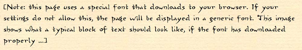
Note: this page uses a special font that downloads to your browser. If your settings do not allow this, the page will be displayed in a generic font. This next image shows what a typical block of text should look like, if the font has downloaded properly …
What is the Hasegawa typeface?
Back in the late 1800s, the publisher Takejiro Hasegawa in Tokyo began producing educational books in western languages. This was the era when western influences were flooding into Japan, and his publications were produced using a mix of technologies - both the old woodcarving techniques and modern methods using type and presses.
For those of his publications made with the old methods (all hand-carved and hand-printed), he ran into a problem with the English lettering. The results on the printed page were not attractive, as the traditionally trained carvers fundamentally had no ‘feel’ for the strange (to them) angular shapes of the western letters.
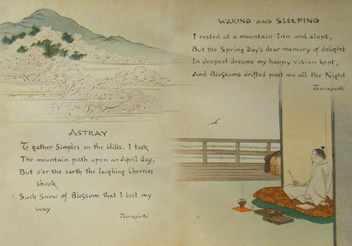
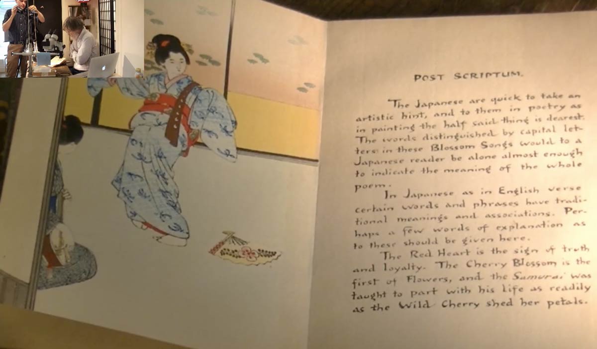
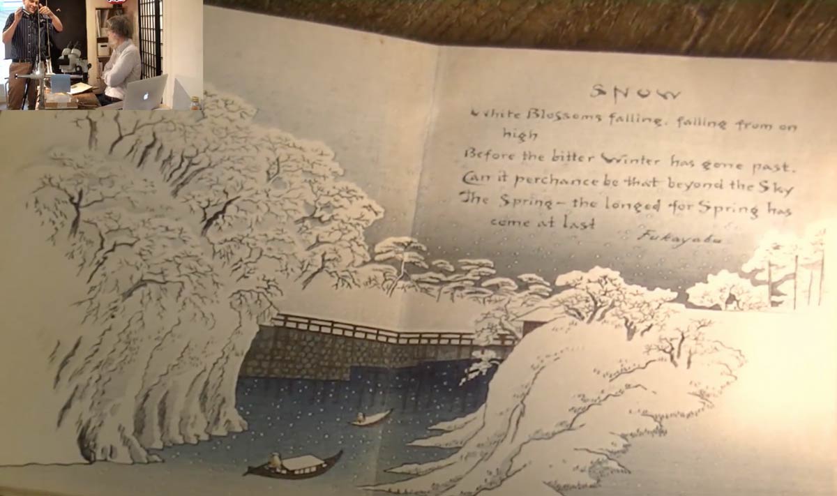
So he came up with the idea to work out a set of English letters in a style that could be drawn with a traditional Japanese brush, and which could thus be carved in a natural manner by his craftsmen. Of course they weren’t calling this a ‘font’ at that time, and we have no record of who did this for him, but for some years his company used this lettering in a number of their publications. We come across it most frequently on covers and in colophons, but sometimes it was even used in body text, as in these examples from the set of three books entitled 'Sword and Blossom Poems', published by Hasegawa in 1907.
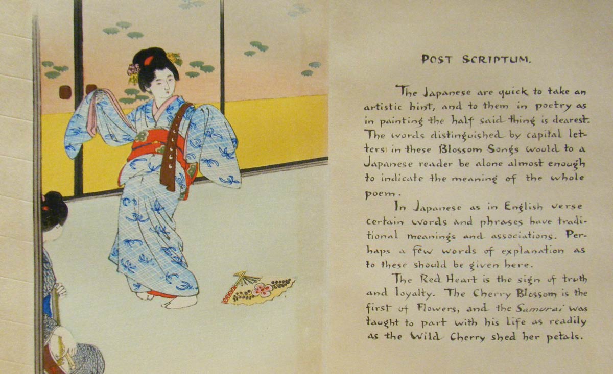
Printing of book pages like those was not done with moveable type. Production began with a calligrapher writing out the text on a sheet of extremely thin paper. This sheet was then pasted face down onto a plank of cherry wood, and because the paper was so thin, the lettering was visible from the reverse side. The shape of each and every letter that you see on those pages was then cut by the carvers, and once the cutting work was finished, the blocks were passed to the printing team, who did the work of inking and printing.
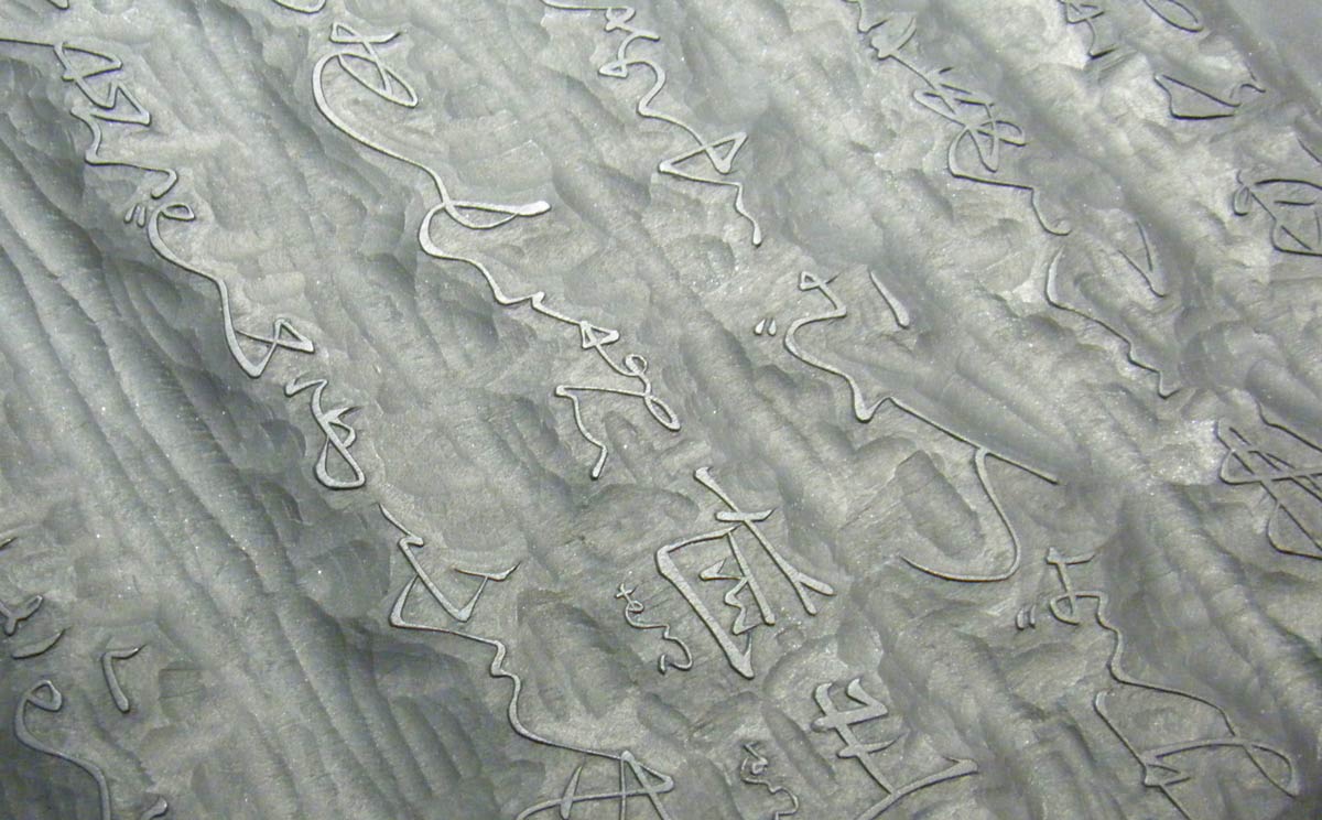
We don't have the original blocks for those same books of course, but here is an example of an old carved block for printing text - Japanese lettering, in this case. The raised areas - the original surface of the wood - will transfer ink onto the paper, while the cut away regions will not.
That was the basic method for producing all Japanese books through the Edo era, and it was actually very efficient, as there was a wide pool of skilled craftsmen available, but the production costs of hand carving each and every letter were not sustainable in Japan's modern era, so standardized metal type became the norm for most of their subsequent publications. The Hasegawa organization never produced a metal type version of this typeface though, and it faded from view.
How has 'Hasegawa' been restored?
Dave Bull, the owner of the Mokuhankan organization, has a personal collection of many old books and prints, including a number of the Hasegawa publications. One day in the early summer of 2019, he showed a few of these books to viewers of his Twitch live stream, pointing out the attractive lettering and chatting about a bit of its history.
Viewers of the stream that day were very interested in this, and among them was a young man from Finland - Markku Mujunen - who owns font design software and has experience at creating original typefaces of his own. He thought this seemed very interesting, and that very day he set to work to make an experimental version of the face, using as source material sample images from some Hasegawa books that he found online. That evening he sent the trial version to Dave, to gauge his reaction.
Dave was very pleased to see this, and agreed to sponsor the next step, having Markku create a full version that people could use. His staff scanned many pages from old Hasegawa books, including as many versions of each character as possible (in upper and lower case) for Markku to use as source material. The two of them agreed that the work would be done at two levels: a standard version of the face that would include a well-rounded character set and a selection of common glyphs and ligatures, and then, as time allowed, a richer fully-featured set.
How to get the Hasegawa font
Markku's standard version of Hasegawa, in OpenType format (.otf) for general use in any application, is available here:
Download the Font
Please contact Markku directly for information on the more comprehensive professional version that he is preparing.
More information
The story of how this typeface has come back to life has also been told in one of Dave’s ‘David’s Choice’ videos on YouTube:
The Twitch stream that started it all has been archived on YouTube by Dave's Twitch fans (discussion of the Hasegawa books begins at 1:26:03):
Thank you for your interest in this project, and we hope you will help spread knowledge of this interesting typeface around the world!