What do I want to see? ...
If I could easily describe what sort of designs I want, then I wouldn't be asking you to create them for me - I would be busy carving and printing my own stuff! So this section will necessarily be rather vague ... please bear with me as I try to verbalize some of these ideas ...
This project will be based in Japan, but although the prints will be produced entirely with traditional Japanese techniques and the craftsmen who will work on the prints are all Japanese, it is not my intention to produce 'Japanese Woodblock Prints', and certainly not anything that even remotely resembles 'Ukiyo-e'.
The materials and techniques will be directly from the Japanese tradition - the subject matter is completely open. Some of the prints illustrated below are examples of prints made early in the 20th century by collaboration between non-Japanese designers and Japanese craftsmen, and those prints were nearly all very 'oriental' in appearance. That was perhaps inevitable given that the designers were just discovering Japan; in their eyes the techniques of Japanese printmaking dictated such a subject matter.
A lot of time has passed since then, and we now have a wider viewpoint on these things. My own experience has taught me that someone born in England like myself can make his home in Japan and live in a quite 'well integrated' way - and so it is that a print design by someone from another country can live together with the Japanese paper and printmaking techniques in a way just as well integrated.
(Please note that this is not be taken that I will reject 'oriental' designs out of hand. One of the people already contacted to design for this series is an artist living here in Japan, and I anticipate that he will be sending me sketches that reflect his local environment. But as I have already warned him - I'm not interested in any of those cliched images: tiled roofs ... decaying thatched farmhouses ... temple gates ...)
So if the subject matter is completely open, then what sort of a guide can I give you? With six prints projected to be in any particular series, I expect to have a variety of 'themes' and moods represented.
Although I certainly won't include six landscapes, there will certainly be some. I am also interested in seeing how designers handle the considerable problems of depicting the human figure in woodblocks (more on that below ...), and portraits done in woodblock can be very intense and exciting. 'Still life' has been one of the major subjects of woodblock artists for centuries, and I expect that trend to continue. I should mention that I'm not much interested in purely abstract work; I want to see things that have a more direct human interest - but if you do have a conception for an abstract image that you think can effectively utilize the woodblock medium, then give it a try ...
I think it might be useful if I show here some samples of prints that I have found attractive, and try to explain something about why I find them so.
WARNING! The images you are about to see are not 'samples' of what I want. Don't try and copy this stuff! I am using these prints here simply to illustrate particular aspects of the woodblock printmaker's art, and as starting points for discussion.
Light
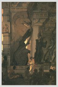
I'll start with this one, because there is nothing else that comes even close to being as important as this. The name for this publishing venture has yet to be decided, but 'The Living Light' is a top contender for that position. When preparing your design, you must be conscious of where the light is coming from. The source of light may be part of the image itself, or the light may be coming from out of the frame and falling across the paper ... But it must be present! What time of day is it? In which direction are we 'facing'? The answers to these questions must be visible in the print.
Do you like Ansel Adams? What, you don't believe that such things can be done with woodblock printing? Yes they can!
Here are a couple of prints (by Hasui and Yoshida) that use light in interesting ways (and you will see more below ...)

Use the Paper
In woodblock prints of the Japanese tradition, nearly all the pigments used are a transparent type. This is not to imply that they are weak or vague - indeed the medium is capable of producing incredibly deep and rich colour. But one inescapable consequence of this transparency is the fact that the paper comes into play as an equal partner with the pigment. Unlike a silkscreen print, where the paper is simply a base to support layers of opaque colour, in a woodblock print the paper itself becomes part of the palette - both its colour, and its texture. Don't be afraid of using the paper as part of the image. It can appear as flat white, creamy, grey, brilliantly bright ... All these shades can be created with nothing more than the natural surface of the paper itself - it all depends on what you surround it with ...
Depth
The question of whether a woodblock print should be 'flat' or should show 'depth' is one that designers have wrestled with for centuries. Traditional Japanese styles of design were extremely flat - there was no shading, no shadows, no perspective ... Objects were sometimes arranged on the page in such a way to give a sense of receding planes, but most work was devoid of any depth. When realistic scenes began to be depicted, a western concept of perspective was absorbed, and later still the gradation (bokashi) technique was used to shade surfaces into an illusion of roundness.
But I believe that woodblock prints are essentially a flat medium (I will argue this point with myself below ...). The kind of modelling that comes naturally to painting or something like airbrush work has no place here - although it is possible technically.
Am I saying that I want you to design in a flat child-like manner? Not at all. Look at this picture (Hasui again) for an example of depth in a woodblock print. (The final print you will see on this page works in a similar way.)
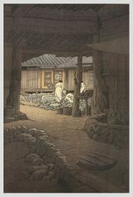
He did it by using 'planes' ... and of course by using light!
So I do want depth ... but I certainly don't want 'realistic' modelling of close-up surfaces. I don't believe that suits this medium. Take a look at this ...
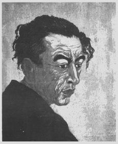
Close up and very realistic - but all done with 'flat' techniques. Great stuff!
Energetic lines
This is a major point; one that I think of as 'blood on the block'. Look at these two prints (one a close-up):
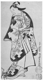
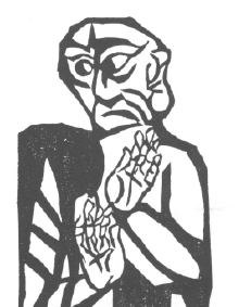
The carving on the left hand print, an old ukiyo-e design, reproduces exactly the brush strokes of the original design. Although I don't mean to insult the carver with this next statement - because a good carver can make lines 'dance', just as a bad one can kill the whole thing - the life in those lines came from the skill and taste of the designer.
Look at the carving on the right hand print - a print by Munakata. These lines were created right there in place on the block - the knives and gouges attacked the wood directly. There may even have been no design in place on the wood when he started. The act of carving, and the act of designing have become one.
The left print, with its 'calculated' method of construction, thus ends up being cool and unemotional in tone. The right hand print ... is covered with blood. Every line shows the living energy of the man who carved it.
So where does this leave us? We are going to be working in collaboration - so does that mean our prints must necessarily be 'cool, calm and collected'? Is there no way that we can create prints that contain visible life and energy?
I think we can - but in order to do so - you the designer will have to produce a sheet of paper with your design drawn in such a way that such life and energy is visible! In any 'collaborative' print - a print in which design and manufacture are handled by different people - the designer has to know exactly what he wants, and he has to be able to get it down on paper. Throw away your drafting pen with its cold, hard and even lines. Grab a tool that has some 'flexibility' - a paintbrush, an oriental writing brush, anything with liquid ink is great ... and let me see some lines with energy and character. Once you can do this for us, the carvers can take over and turn it into a finished print - one that will reflect and radiate that energy. But it must come from you!
Atmosphere
Here are two prints designed in the pre-war period by the same person (Pieter Irwin Brown), of basically the same subject, and made with the same techniques. One is boring, and I won't look twice at it ... tile roofs in the snow - give me a break! But look at the other one ... the same cliche theme - but what a difference!
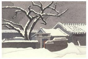
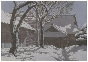
Give me a design with this much atmosphere, and I don't care if it's the most hackneyed theme that has ever been done, I'll sit up and pay attention.
Mystery
Here's another print I find fascinating. (It was made in about 1915 by Fritz Capelari)

I know what the 'artspeak' boys would say about this one ... "This print forces the viewer to start asking questions: What or who is behind the screen? What is holding her attention so raptly?" etc. etc. I don't really speak that kind of language, but I do know that this print is fascinating. Maybe they're on to something?
Those were some of the things that I want to see ... How about the other side of the picture - what don't I want to see?
Reproductions
Some years ago I went to an exhibition here in Tokyo that featured just one single print. The men who made it were very proud of it - proud enough to mount an entire exhibition devoted to just this one work. It was a reproduction of a Cezanne watercolour, done with hundreds of woodblocks and hundreds of impressions. You couldn't tell it from the original (they were displayed side by side).
It was the most ridiculous thing I've ever seen. Yes, it proved their point - that the woodblock medium can be used to do anything, but to my eyes it was nothing more than a spectacular waste of time and materials.
I don't want woodblock prints to be just copies of paintings. Although many of the prints I have made myself (my poets series, for example) are in the ukiyo-e style, and thus very similar to traditional painting, this is not a method that I wish you to follow.
Think woodblock!
Mud
Not to belittle this artist (Hiroshi Yoshida), because he produced some wonderful prints, but this particular one illustrates very well one pitfall of 'overproducing' a woodblock print.
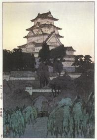
Mud, mud and more mud. It's not my place to try and analyze this artist, but I suspect that his extended background in oil painting may have influenced his subsequent printmaking work.
Please don't think 'dark' and 'heavy'. Prints can be deep in tone and yet remain transparent (see the Pieter Brown example above).
'Filled paper'
This is perhaps the opposite of what I said above about 'Use the Paper'. Don't feel that you've got to fill up every corner of the sheet. Try to think of the edge of your paper as a 'frame' - within which you will place a balanced picture. Don't necessarily think of it as a frame in the usual western sense - as a border that is clipping off your view of a larger scene.
'Airbrushing'
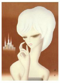
This is a repetition of what I tried to express above about designs that don't suit the medium. Believe it or not, this is a photo of a woodblock print. Now I like the gradation technique ... but please!
Don't bore me!
This is a toughie. One man's meat ... etc. etc. But try and look at your design with the eyes of someone seeing it for the first time - perhaps on a gallery wall. Is your picture going to 'grab them' a bit? Or are their eyes going to glaze over as they move on to the next one? Again, without getting into 'artspeak', at least ask yourself the question "Just why does this print exist?" If you can't find an interesting answer to that, then perhaps that tells you something ...
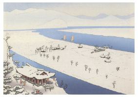
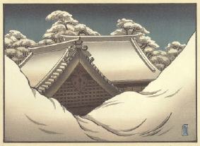
Here are a couple that sent me to sleep pretty quickly ...
Now that we've sorted out just what it is that I'm looking for, ("We have?" says you the reader!) before you set brush to paper, there is another major question that must be decided: Will this print revolve around the 'line' or the 'mass'?
Here are a couple of examples of what I mean (prints by my friends Gary Luedtke and Matt Brown):
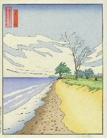

In the left print, everything is defined by the lines, and in fact if we take away the colours, the design stands alone just fine. This is of course the very foundation of most traditional Japanese printmaking - the line, the line, and nothing but the line.
In the right print, the line has gone, and the design is now made up of 'masses' of colour.
Which will it be? Your decision will have a great effect on the way that the print will be produced. A 'line' type drawing will be 'easier' to make. The drawing you supply will be carved and returned to you, and colouring can then be anything from a simple 'fill in the lines', to an involved multi-layering. But whichever it is, it can proceed in relatively straight-forward steps until a final arrangement is reached.
The 'no-line' type can in some cases be quite simple - in fact the example I just showed would be one in which it would be relatively easy for the designer and printer to arrive at a suitable arrangement. But what about something like this ...? (Hasui again)
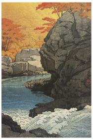
How on earth are you - a designer sitting over there, and the printer - sitting over here, ever going to be able to arrive at something like this? Can you, looking at this image now, separate it into its constituent elements? I rather doubt it. Trying to make this sort of print under these circumstances would be difficult, very difficult indeed, and that's why I would suggest that for this first series of prints at least, you try and restrain yourself with the amount of complexity in your design.
If the first series of prints is successful, and this venture becomes a going concern, then as the years go by there will be plenty of time to explore the capabilities of the medium. They are, I believe, pretty much infinite. I want to be a partner in the creation of prints as beautiful as any that have been made. That may turn out not to be possible - perhaps I just don't have either the taste to select suitable designs, or the ability to bring all these different elements together. This venture may fail miserably.
But then again ... it may not. There's only one way to find out.
I'm ready, and am waiting for you.
![]()
Tokyo