« Nice newspaper coverage ... | Front Page | Full House! »
Major update to 'Heroes' website
Posted by Dave Bull on October 13, 2013 [Permalink]
Once I completed the carving of the 'I Choose You' print a week or so ago, and then did a quick runup of a colour proof, ready to turn it all over to the printing crew for making the actual edition, I realized that this was quite a milestone for me - with that job now behind me, my part of the Kickstarter fullfillment is finished ...
During the course of that wonderful campaign in August of last year, we booked the production of seven Ukiyoe Heroes designs. I was to carve and proof them, and my staff (and outside printers) were to print them. As I write this, the ladies here are all busy each with a batch of this design (I'll post some photos of their work soon), but for me ... I'm done!
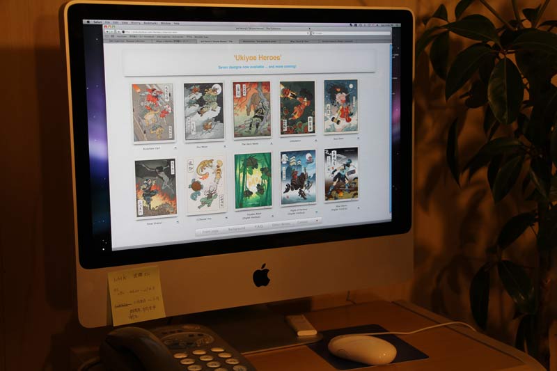
So I spent a big chunk of yesterday on a redesign of the Heroes website, so that everybody can have a chance to see what I can see here in our workshop - all of the Heroes prints together (seven completed, and three scheduled):
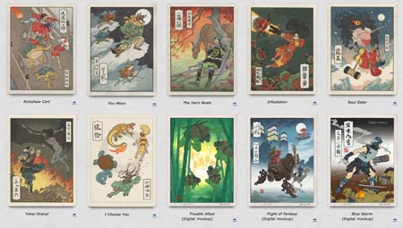
Don't bother clicking that for an enlargement, as there isn't one. Just go and visit the new page for yourself. If you have a nice large desktop monitor, drag the browser window open as wide as you can; it'll give you a fantastic view of the series:
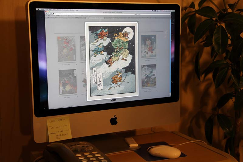
... and you can popup each one for a 'larger than life' enlargement:
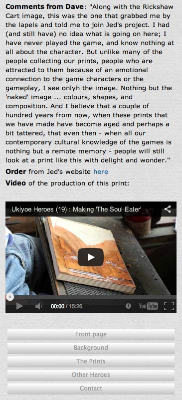
Each print links to a page with other photos and scans, and Jed and I this afternoon did an extensive Skype 'interview' from which I extracted comments from both of us giving some background to the concept and production of each one of the prints in the set:
In addition, I have collected on each page all the relevant videos from my YouTube channel, so that - for the first time all collected in one place - you can now get a convenient and comprehensive overview of how each print was made.
I mentioned that it looks great on a giant desktop monitor, but I have also programmed it so that even if you have nothing larger than a smartphone, it still all works properly, including the video views:
And I shouldn't fail to mention that the upcoming next three designs are also included, and ... let's see, did I forget anything ...? Oh yes, each page has a well-placed link to jump directly to the order form on Jed's shopping cart! :-)
Added by: Dave on October 14, 2013
Seeing the ten designs all together on the page immediately brings up a question: how many are there going to be in all?
Jed and I haven't the slightest idea. The theme is basically inexhaustible, so there is no inherent limit from that point of view. As things stand at present, we are looking at this on a 'one every two months' schedule, and have already started taking orders for the next four images, which leaves me committed up to next summer. But we have no intention of stopping there. As long as there is interest, we'll keep at it.
He and I have sometimes joked around that we should actually put a little number on each one, perhaps in one of the cartouches, and shoot for a set of 100 designs. At our present rate of one every two months, that would take just over 16 years, start to finish, meaning that by the end Jed would be about 45 years old, and I would be about 77.
Doable, I think. After all, I can already say, "Been there; done that," so '100 Heroes' doesn't scare me at all! But wouldn't that be quite the Kickstarter!

Added by: Albert A on October 14, 2013
It sounds from this post like your apprentices are moving up to doing batches of the Big heroes prints, not just chibi. If so, congratulations on their graduation to the big leagues! The pokemon print does look like one of the easier designs to print, but even so. Hopefully their progress won't be putting Numabe-san out of work, though I suspect the shin-hanga style of the next few prints could be right up his alley...
Added by: Albert A on October 14, 2013
Also, if I may critique the site... it should be much easier to find my way from your Mokuhankan Heroes site to Jed's store for ordering. A tiny link buried in the detail view of each print is not easy enough. It took me several minutes of looking over the site to even find that link.
At the very least, I'd suggest putting an "Order Prints" button in the bottom bar, with at least a bit of contrast from the other buttons. I know you want to draw attention to the prints and not the money, but at the same time it's important to make it as easy as possible for folks to order them. There were comments about the Portraits rollout with folks asking how to subscribe because the website didn't make it clear enough.
Added by: Dave on October 14, 2013
graduation to the big leagues ...
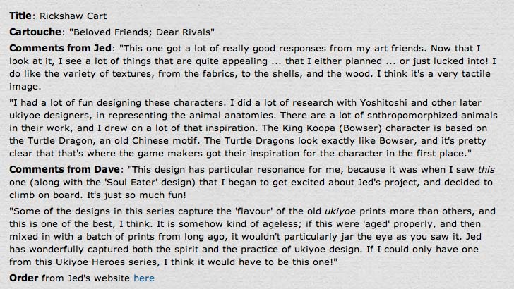
This isn't the first time they have done Heroes. Back at the beginning they were doing the Rickshaw Cart design (along with me) before the orders turned into such a tidal wave that we had to start using outside printers too. In fact, we just shipped a bunch of staff-printed Rickshaws to Jed last week.
They are so slow though, and there is such a high reject rate still, that we couldn't possibly run this business without the help of those three outside guys. But yes, this image is a very important step for them in their training. It's kind of a 'large Chibi' in one sense, with small areas of flat colour distributed over the paper. It's not trivial to print, with the most difficult thing for them being the balancing of the depth of the tones, so I am supervising each and every one of them for every colour they apply, which is sucking up a huge amount of my time this month, but it can't be helped.
Today's a holiday Monday here in Japan, but Ayumi-san and Fujii-san will be here nonetheless, working on their batches of this design ...
As for the order links on the web pages, I kind of thought they were adequate - without being 'in your face' - but if they were difficult to find then no problem. I have just amended the style sheet to make them (a lot) larger and more visible.
(And fully-styled HTML code is so much easier to work with ... Making this change took just a few seconds of re-styling. I have no idea how I am ever going to deal with the thousands of 'old code' pages all over my website. There are some there that haven't been updated since 1997 ... )
Added by: Albert A on October 15, 2013
Much more clear! I'd say you should also put one on the 'table of contents' page, but now at least it's clear when you're looking print by print.
Add Your Input