« Hilo Bay [9] - First Proof | Front Page | Aspen Grove [3] - Block Cutting »
Hilo Bay [10] - Second Proof
Posted by Dave Bull on April 22, 2006 [Permalink]
Continued from Hilo Bay [9] | Starting point of the thread is here
OK, here we go ... another very long day's proofing work, and we've got it this far now ... (this pops up to a much larger version ...)
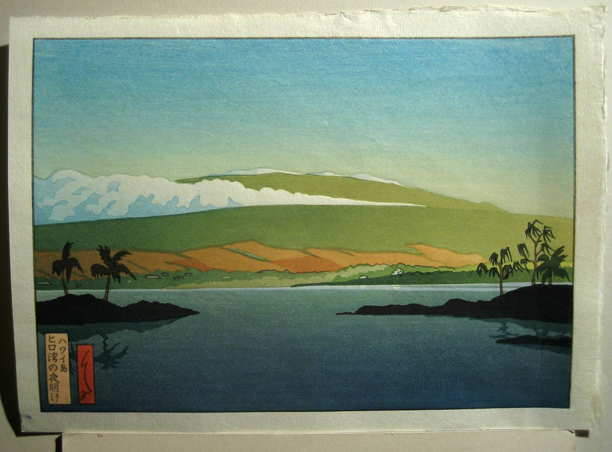
Much closer than yesterday's version ... not quite sure what to think about it just yet. And it's nearly 12:30 ... just about had enough for the day. Signing off now, and I'll think about this a bit more in the morning ...

The thread continues in Hilo Bay [11] ...
Added by: Gary on April 22, 2006, 2:46 pm
Definite improvement, but we're not there yet. I don't think I need to mention what needs to be done where, as a direct comparison with the digital print will show that. But this is markedly better and on the right track. Some of the atmospheric magic is starting to come through the haze.

Added by: Dave on April 22, 2006, 6:38 pm
Mostly a day off today, prepared a bunch of back issue prints for shipping tomorrow, then took a walk with Sadako-san this afternoon. Just made a few sheets of paper wet for another kick at this cat on Sunday.
a direct comparison with the digital print will show that.
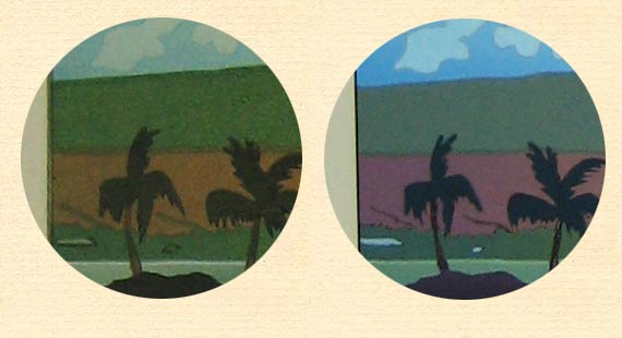
OK, let's have a go at that ... I took this photo just now. It's a cloudy day today, perfect for trying to get an 'average' shot of a print. I laid Gary's master copy (the ink jet he sent me) on the ground together with one of yesterday's prints. I also took the time to set the camera's white balance properly, so what you are seeing is pretty much what the two of them do look like (if your monitor is calibrated to an average value ...)
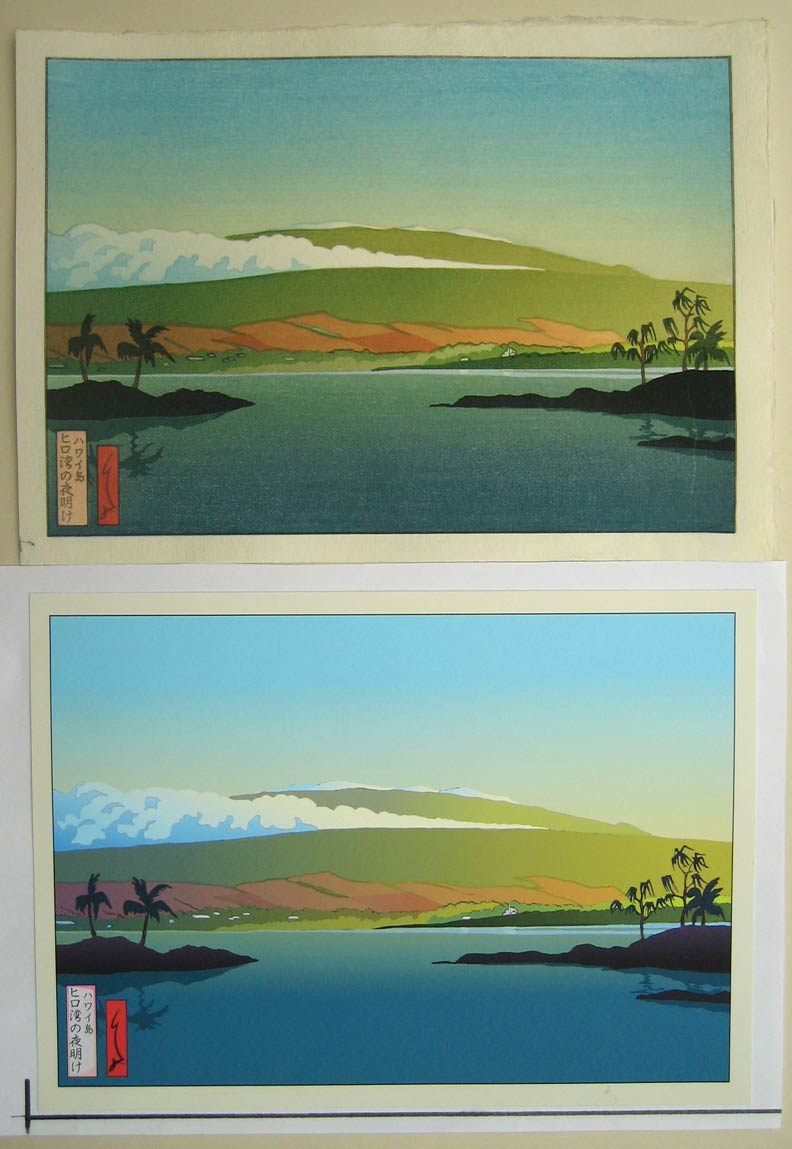
OK, let's take them apart:
The sky:
The only way that I have available to get that 'chalky' blue is to mix white gofun into the pigment, and I really don't want to do that. It would be closer to the master, but it just wouldn't have the right tone or feel for a woodblock print (killing the transparency).
A similar situation applies to the blue/green balance at the bottom of the print. Gary's 'pure' sort of blue there is 'clicked' into place with his paint program, but mine is printed - with transparent pigment - over the greenish base colour. It would be theoretically possible (and I actually tried it once yesterday) for me to do a green gradation down and then a blue gradation up, but getting them to match up smoothly would be next to impossible.
The 'glow':
You can see here that I have brought my sky blue just a shade too far down. And, on the yellow-green areas, my darker overlay comes a bit too far to the right. The base colours underneath are spot on the master copy, but it is going to be fiercely difficult to control the tapering off of these gradations!
Getting it to glow more than this is going to be difficult. Making a 'glow' in a woodblock print is usually done by surrounding an area of lightly-printed pigment with darker shades. The darker they are, the brighter the glow. But this print has no darker surrounds.
Another 'problem' is the whites. Go back up to the photo of the two prints together, look at the open cloud areas, and compare them with the print margins. The cloud shows the bare paper - my 'washi' white, and Gary's computer paper white. In both cases the clouds seem very white because of the surrounding darker colours.
But ... over on the margins we are no longer looking at bare paper in both cases. Gary has tinted his with a deeper tone in the margin - that's not the 'natural' paper colour - to help create the glow in the image area, but this tone doesn't extend under the bright mountain/sky areas, where I'm 'stuck' with the cream tone of the paper, which does, thus 'dulling' those areas ...
Next, the upper mountainside ...
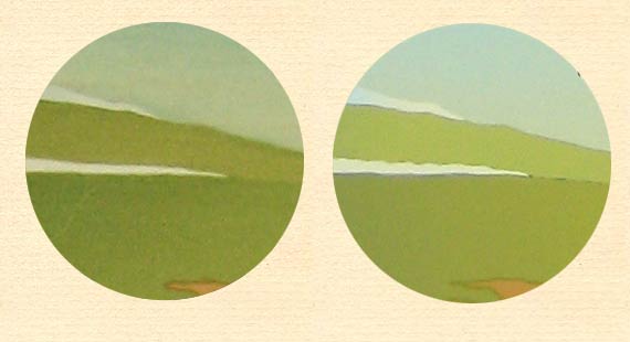
I don't have enough difference between the two levels of mountainside. I suppose the higher elevations should be a bit brighter, catching more of the morning light. (I had this better yesterday ...)
Over at the other end of the mountain, I've got the colours off quite a bit:
Mine is way too green, and I think that's an over-reaction to the first proof, where I made it too gloomy. It's a hard balance to find. And what is also causing trouble here is that the gradation on the yellow/green areas of the mountain has to match (in taper) the gradation on the earth area ...
(I also have to trim off the overlap along the lower edge of the blue cloud block. I thought that I could get away with it, as the mountainside would be darker, but it seems not ...)
So anyway, those are the parts I'm going to focus on tomorrow, for what is going to be the last proof in this series just now (I've got to switch back over to work on the scroll project from Monday). If anybody has anything else specific to toss into the mix, speak up now!
Added by: Gary on April 23, 2006, 2:33 am
It's getting a little more difficult for me to say "see the digital" because from my monitor, the digital print you have in comparison to the woodblock print looks too light to me. The shadowed areas of the clouds on the left mountainside do not appear to be dark enough to offer a better contrast as I think I had on the digital. When I pull up the original here, it is a bit darker and more contrasted, which heightens the effects. What I see on your woodblock print looks too light, but then the digital looks too light as well. But this could be your digital camera shot, the fact it's perhaps lower resolution, the lighting you are using, it's hard to say. I think your remark about the contrast is right, it needs a bit more between light and dark.
I think a little darker coloring of the gradations on the left side, and also at the bottom across the water, will heighten the effects desired. Then we'll have to see. It is getting closer!
I think the sky is o.k., we just need to orchestrate the rest to it.
Added by: Gary on April 23, 2006, 2:35 am
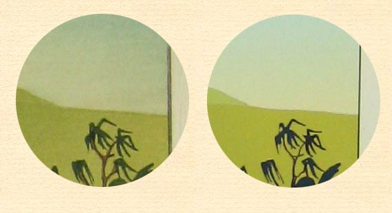
P.S. In your lower binocular view, you have missed carving out the right rooftop which is outlined, but printed green.
Added by: Jacques on April 23, 2006, 8:37 am
Dave, whatever the outcome, I find it wonderful that you're having a go (well, actually _three_ of them) at printing this technically very difficult image!
I'd say your efforts definitely point out the huge difference between getting an image out in an analogue versus a digital version. By and large, the possibilities of digital reproduction are -by their very nature- much easier to accomplish than the down-to-earth use of manual tools.
As an example I'd like to tell you about a Dutch guy from whom I bought a 'print' a few months ago. To give you an idea of his work, see his website. I bought the very symmetrical 'print' consisting of a greenishly-lit building at night reflected in a pond in front of it from him that you see on this webpage [Image here]. He told me that the design of a digital print is a two-sided coin to him: On the one hand he loves the enormous flexibility that his computer has to offer, but the endless possibilities in terms of colours and (easily achieved - just a few mouse clicks away) colour gradations also often drive him completely nuts! He told me he often just doesn't know where and when to stop...
All I'm driving at is that the two approaches are inherently different, and that it would be hopeless and self-defeating if you'd go for an exact replica of Gary's (digital!) design, as far as I can see.
Still, apart from the things you already mentioned, one thing I noticed when comparing the analogue and digital versions of Gary's Hilo Bay print is that the agriculture fields on the hill side as well as the islands in the foreground graduate out in much more pinkish/mauvish kind of colour in the original digital versions of the print than in your analogue counterparts. I think these may also contribute to the 'early morning feel' Gary originally intended.
But then, I'm not quite sure whether your current efforts are mainly focussed on a correct lining up of the blocks you carved, or on reproduction of the exact original colours also...
Good luck with your 'last ditch attempt' at printing Gary's Hilo Bay design today!
Added by: Dave on April 23, 2006, 1:07 pm
The shadowed areas of the clouds on the left mountainside do not appear to be dark enough to offer a better contrast as I think I had on the digital. When I pull up the original here, it is a bit darker and more contrasted, which heightens the effects.
No question, that's one of the places I need to darken. Talking to Mike on the phone this morning (Skype again!), and he suggested I used a more reddish overtone there. (I had previously used blue/grey) ...
you have missed carving out the right rooftop which is outlined, but printed green.
Still a bit unsure how to handle that. The houses have become darkened because I left those areas 'in' on the 'beta-ban' - the block of flat colour for the final gradation over all the mountain areas. I was afraid that if I cut them out, the houses would shine too brightly. But I think I will cut them ... should give the effect of the roofs catching the light ...
it would be hopeless and self-defeating if you'd go for an exact replica of Gary's (digital!) design, as far as I can see
Well, that's impossible, as we can see from the work so far. But I do think we certainly need to get more of the atmosphere, as Gary points out.
Very interesting stuff at that link you posted, Jacques! Plenty of food for thought there; when I can grab a bit of time I'll pick some of his images and make a general post for discussion. (Or one of you, please feel free to start a thread about these images and their potential for becoming woodblocks - or whether or not that would have any 'point' ...)
Jacques, do you know Mr. Veerkamp well? Does he speak English? If so, then please feel free to toss him the Mokuhankan URL; I'd be interested in hearing what he has to say about these things ...
... the endless possibilities in terms of colours and ... colour gradations also often drive him completely nuts! He told me he often just doesn't know where and when to stop ...
But that's also a perfect description of the woodblock process! Imagine if Gary and I were doing this the old-fashioned way, working from his line drawing, and sitting together to create the actual image in this proofing process. How on earth would we know where to stop?
Actually, I can answer that easily - when the money ran out! If I wasn't doing this myself, but hiring Numabe-san to do it, I would have run up a nice little bill for 60,000 by now ... three days of proofing @ 20,000 yen per day. (Although I certainly admit that he would be a lot more productive than I have been ... getting more variations tried out, I'm sure.)
Added by: Marc on April 23, 2006, 4:29 pm
Dave,
When I visited with you in October, we went to see a shin hanga exhibition at Machida. I remember calling you over to look at this print designed by Chiura Obata, executed by Takamizawa's shop. I was having trouble believing that it was really a woodblock print. It looked like a watercolor painting.
You stood there shaking your head and gave me a speech to the effect that, "Yeah, it can be done, but it is so difficult. Why go through all that? It's getting away from the essence of what hanga is all about."
As I look at Gary's Hilo Bay image created on the computer making use of the amazing power that exists in the digital medium, and your efforts to implement that image in woodblocks, and the difficulty you're having, I'm wondering. Why would the same guy who wouldn't think try to tackle a Chiura Obata watercolor go after a Gary Luedtke digital composition?
Marc
Added by: Dave on April 23, 2006, 4:52 pm
It's getting away from the essence of what hanga is all about
Well, given the example you show, I'll stand by my statement 100%! In that case, I really don't see the point of using woodblocks for it. What you want to see in that image is 'brushstrokes', and that's just not what woodblock is about.
But as to whether or not there is any point in continuing to make woodblock prints of this general shin-hanga type, now that the digital methods make it so 'easy' (sorry, Gary!), I am far less confident in my answer.
We're now at the stage where we certainly can't claim: "We do it this way because there is no other way to get the image we want!", as was the case 'back then'.
Ask Gary - why does he want a woodblock print of his image, when by his own admission, such a thing won't come up to the standard of his digital master?
I guess the only reply is that to a certain kind of person, the 'high-touch' aspect of these prints is important; the texture of the pigment/paper combination, the wabi/sabi feeling of a print as it 'matures' over time, the relief effects that are not present in the mechanical images ...
In addition to those things for the viewer, for me the maker, there is of course the pleasure (hah!) of overcoming the technical challenges ... :-)
Added by: Julio Rodriguez on April 23, 2006, 7:31 pm
The foreground islands in shadow seem to have a bit of purple/reddish cast...which is missing in the proof and also the hills on the left side have a bit more red/brown...while the proof is more brownish...also the white details on the left side need to stand out more...
Added by: Lynn Matsuoka on March 12, 2009, 11:54 pm
Beautiful images, and I am especially drawn to anything Hawaiian done beautifully. In the interest of considering the possibility of purchase, how can I find prices for these beautiful pieces?
Add Your Input