« Hilo Bay [2] - Genesis cont... | Front Page | Stormy Seas »
Hilo Bay [3] - Questions ...
Posted by Dave Bull on March 12, 2006 [Permalink]
Continued from Hilo Bay [2] | Starting point of the thread is here
Gary,
While talking with Numabe-san this afternoon in the coffee shop at Ueno Station, we spent some time going over your printout of Hilo Bay. We were mostly trying to work out a good way to cut the blocks - where to overlap them, and where to butt them up, etc., but a couple of things came up I need to ask you about:
1) the greens over at the right hand side:
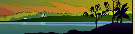
Are these different areas of green meant to be basically the same kind of ground cover, illuminated differently, or are they inherently different? I have to decide how 'related' to make them; whether or not to run them underneath each other ...
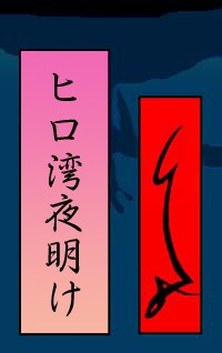
2) the title cartouche:
Is this font something you really like, or just something you had around? I myself think it's not so attractive ... and it doesn't 'balance' well. The old ukiyo-e cartouches worked vertically, because the Japanese writing looks great that way, but vertical English lettering is a different story ...
Could the title be moved out to the margins, as in most shin-hanga prints, maybe horizontally at the bottom, or do you really think it's an integral part of the design, and should be kept 'inside'?
The 'GL' I have no problem with at all ... (although you know I have never met anybody who could 'read it' without being told what it says)!

The thread continues in Hilo Bay [4] ...
Added by: Gary on March 13, 2006, 9:12 am
1. The 'greens' are inherently different. They represent three distinct distances and vegetation. They, as you will have noticed, all grade out darker as they go left. I'd say slightly overlap these blocks and you should be o.k.
2. The cartouches. Yes, they need to stay in the image with the colors in them shown. A compromise I will make is if you want to translate the title into Japanese and use that calligraphy in the cartouche, and then put the English title in the lower margin, a la Yoshida, in an attractive font of your chosing, that is acceptable. The signature cartouche should stay as is.

Added by: Gary on March 13, 2006, 9:16 am
P.S. On my 'GL'. _I_ know what it means. As people get to know my work they will soon associate that symbol with my work, in the image area, and will instantly know who designed the print. If no one understands it now, that's o.k. You're going to change all that, right? : )
Added by: Dave on March 14, 2006, 7:41 pm
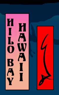
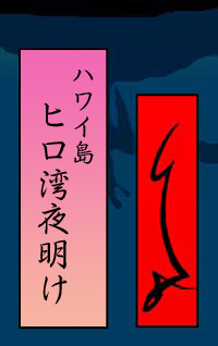
Fooling around a bit ... here are a few ...
That reads "Hawaii, Hilo Bay"
That is just "Hilo Bay"
This reads "Hilo Bay, Dawn"
None of the three have particularly pleasing proportions ...
Added by: Gary on March 15, 2006, 1:48 am
I suggest a modification to number 3. Move the column of writing to the left or right and insert the Japanese version of 'Hawaii" in the parallel column, whichever side would be most appropriate for Japanese readers. Can you do a mock-up like that?
Added by: Julio Rodriguez on March 15, 2006, 2:16 am
Hello Gary, just stopped by to say hello and let you know I find the Hilo Bay image very striking. Also I am enjoying the back & forth discussions between you and Dave...it gives an insight into the whole design process...take care.
Added by: Gary on March 15, 2006, 3:55 am
Thanks Julio, we'll see if we can steer our way to making a striking _woodblock print_ of it as well! This cooperative effort is a challenge in learning when to step in and when to step out of the way, so this should be interesting. I'm really looking forward to it. I am confident however that "Hilo Bay" will get the best attention possible under Dave's exacting eye, so my only concern is doing _my_ part as well. I hope you feel free to jump in with your comments as we go along, they are always welcome.
Added by: Dave on March 15, 2006, 8:23 am
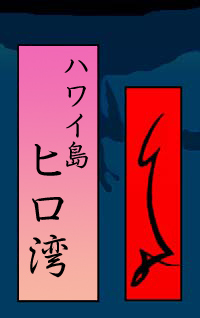
This now reads "Hawaii Island, Hilo Bay, Dawn". Or more accurately, "Hawaii Island, Morning Light at Hilo Bay" ...
Added by: Gary on March 15, 2006, 9:47 am
I think a larger font size is required. The enhanced translation sounds very nice. Could I see another mock-up please with larger script if it's not too much trouble? (Is the script you're using a standard font or are you doing this with your new Wacom stylus?)
Added by: Dave on March 15, 2006, 1:00 pm
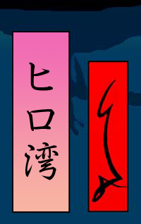
Starts to get a bit cramped in there ... not sure if it should perhaps go taller ...

This is one of the standard fonts that comes with Epson printers here ... You don't want to see a David 'original' calligraphy version ... not at all!
Added by: Gary on March 15, 2006, 1:22 pm
This is the best one so far. I don't think the cartouche should go taller at all. I would shift the left column of script further left, then enlarge the Hawaii script in the right column a bit more. In the overall print the cartouche will be fairly small so the script should be large enough to be readable. The character size of the left column looks good to me, the right column should be just a notch down from that.
Added by: Dave on March 15, 2006, 3:29 pm
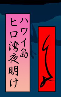
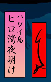
Problem with making the short column larger is that we end up with a big empty space at the lower right ...
Another point: the four characters in the right column are 'ha' 'wa' 'i' 'shima', meaning "Hawaii Island". Do you think of this print as being part of a series about Hawaii (as a whole), or Hawaii (the single island)?
And ... just for fun, I typed that same title into Google (Japan), and came up with this ; I guess it's the same place ... ?
Added by: Gary on March 15, 2006, 9:49 pm
If you drop the right column a bit toward center that should balance it better and correct that 'big empty space'.
As all of my scenes in this series are Hawaiian scenes, I title them with the specific location and then the island it is found on. I do not say that it is in the 'state' of Hawaii, I don't think it's necessary nor is there the room to do that in the cartouche. The advantage of Japanese characters that represent syllables or words themselves, is that much more information can be given in a small space. Your title, "Hawaii Island, Morning Light at Hilo Bay" is perfect.
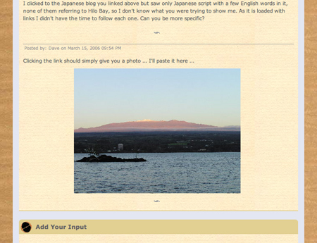
I clicked to the Japanese blog you linked above but saw only Japanese script with a few English words in it, none of them referring to Hilo Bay, so I don't know what you were trying to show me. As it is loaded with links I didn't have the time to follow each one. Can you be more specific?
Added by: Dave on March 15, 2006, 9:54 pm
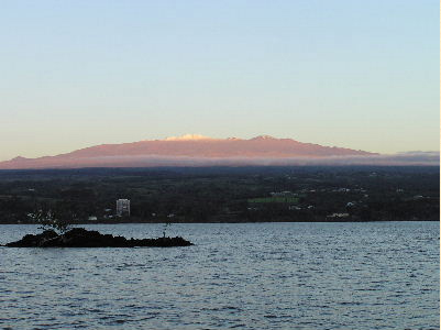
Clicking the link should simply give you a photo ... I'll paste it here ...
Added by: Gary on March 15, 2006, 10:34 pm
I get a white box with a red x in it, non-clickable.
Added by: Dave on March 15, 2006, 10:48 pm
Well somehow you are being banned from seeing that site! Here's what I see ...
Added by: Gary on March 16, 2006, 12:48 am
Yes, this is Hilo Bay. Slightly different angle from where I stood, but quite close. That is one of the little islands in the foreground which also appears in my scene. Hasn't changed much in 30 years, at least what you can see in this shot. That's just a narrow shot of Hilo on the far side, the town surrounds the bay.
Added by: Jacques on March 16, 2006, 1:21 am
Hello Gary and Dave,
I had the same problem with the link as you Gary, but found that this one works properly:
http://blog16.fc2.com/a/alohagarelly/file/2005_0211_065612.jpg
I'm looking forward to see Hilo Bay materialise as a print, and will certainly order it from Mokuhankan if it is done by your exacting standards Dave!
Good luck with working out the cartouche (it's looking better and better)...
Added by: Dave on March 18, 2006, 9:14 pm
Got some advice from Sadako on the exact wording of the title, and she strongly recommends adding a possessive marker. Difficult to exactly show the nuance of the difference in English; it's as though we had "Hilo Bay Morning Light" before, but now it would read "The Morning Light of Hilo Bay" ... That sounds pretty stilted in English, but it's smooth and clear in Japanese.
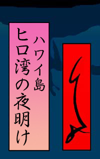
I also adjusted the kerning (bringing the characters a bit closer together) so it doesn't look quite so stretched out ...
Added by: Gary on March 18, 2006, 11:20 pm
As this is printed in Japanese, then of course whatever is most appropriate in the wording is fine with me. In English, I rather like 'Morning Light at Hilo Bay'. If in Japanese it is more proper to say 'Morning Light of Hilo Bay', that's o.k. I like the spacing in this one and can't imagine a better layout, so let's go with this. If we opt for an English translation somewhere, I would like then for it to read 'Morning Light at Hilo Bay'. Will that work for you?
Add Your Input