« Countdown ... | Front Page | Hilo Bay [5] - more block planning »
Hilo Bay [4] - block planning
Posted by Dave Bull on March 19, 2006 [Permalink]
Continued from Hilo Bay [3] | Starting point of the thread is here
Been starting the work on the Hilo Bay block planning. For such a simple image, there are going to be a lot of blocks ... I was thinking that my price estimate on this one was high, and that once we were ready, I would be able to put the price down, but there's no way I'll be doing that!
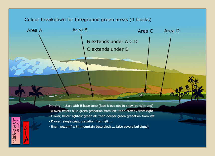
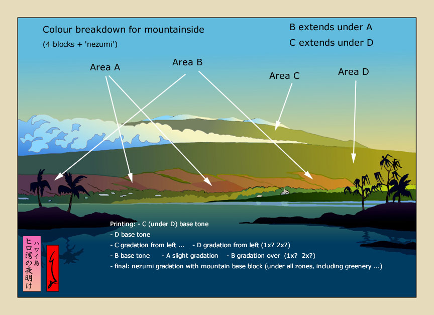
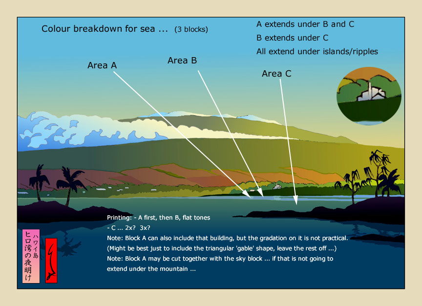
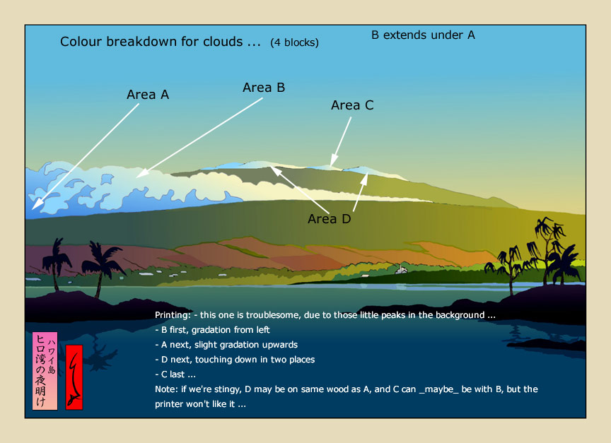
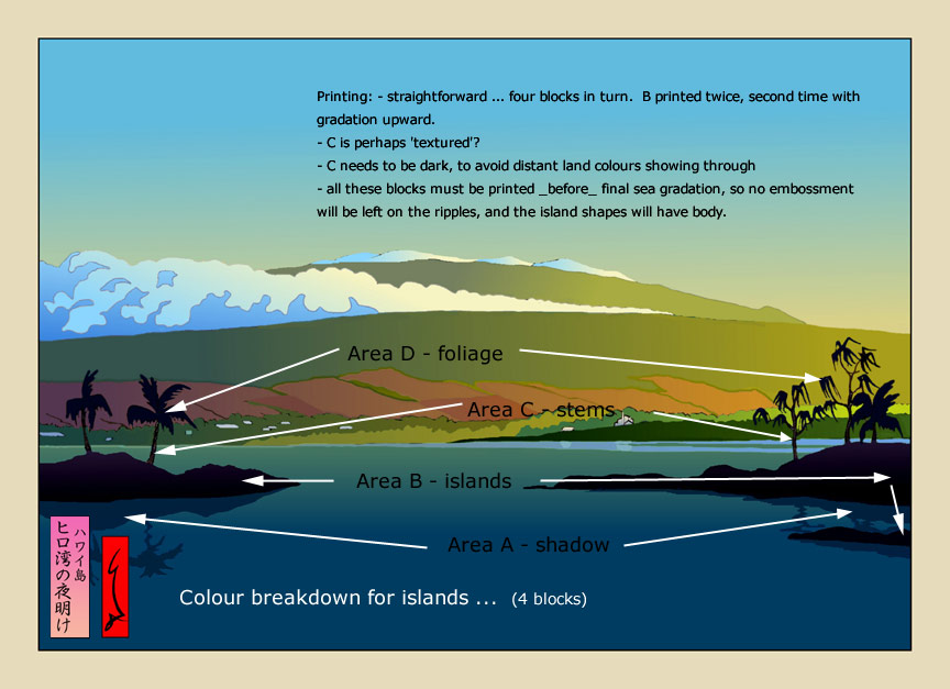
First step is to define the areas in terms of what brushing will be done on them. (What I mean is that at this stage, no thought is given to how the areas will actually lay out on the pieces of wood; some of them will be combined when it's time to actually figure out how to best carve them ...)
Here is a set of images showing the first stab at area definition.
Vegetation:
Mountainside:
Sea:
Clouds:
Islands:
The rest:
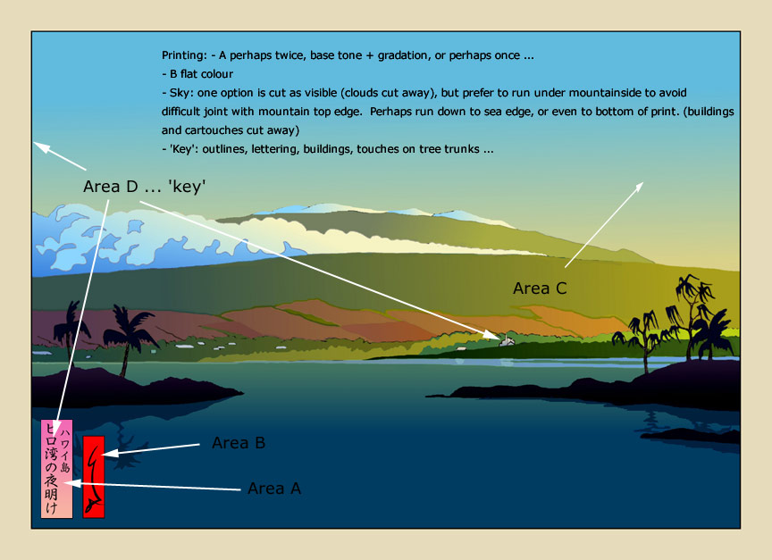
So .... it looks like around 33 ~ 37 impressions, depending on how many gradation overlays some of them take. It may turn out that some of these blocks can be functionally combined; I'm thinking that vegetation block 'A' will probably end up being the same block as mountainside 'D' ...
(Gary, I tell ya, just for fun one day, have a stab at designing a print without using the gradation tool in your computer program. I'm half-serious ... see how well the images stand up when only the 'bare' design is visible ...)

The thread continues in Hilo Bay [5] ...
Added by: Gary on March 20, 2006, 1:09 am
(Gary, I tell ya, just for fun one day, have a stab at designing a print without using the gradation tool in your computer program. I'm half-serious ... see how well the images stand up when only the 'bare' design is visible ...)
They do not 'stand up' particularly well sometimes without the addition of something to give them atmosphere or depth. For some designs,more line may be appropriate. For some landscapes however, and particularly those without many dramatic elements inherent in them, such as Hilo Bay, the 'atmosphere' can be the highlight of the scene. In creating this atmosphere, gradations can be indispensable.
I am near certain it was the effects of these gradations that caught your eye and attracted you to this print, not particularly the 'design' of it. Am I wrong?

Added by: Dave on March 20, 2006, 12:24 pm
I am near certain it was the effects of these gradations that caught your eye and attracted you to this print, not particularly the 'design' of it.
Of course ... and I wasn't 'complaining' about it, or I wouldn't have selected this one! Just that as I did the block breakdown I was a bit struck by the fact that there are essentially no areas here without gradations, if you except the red cartouche (and I guess the tree fronds).
I've written before about feeling uncomfortable with the style of woodblock printmaking that gets too far away from clean black outlines and flat colour; the stuff can start to look like silkscreen work. That's obviously not the case here though ... Anyway, I was just thinking out loud ...
Added by: Gary on March 20, 2006, 1:10 pm
Alas...... the red cartouche has no need of gradation. Should we do it anyway? : )
Added by: Gary on March 23, 2006, 7:17 am
I believe you could combine 'Area A' on your 'vegetation' block, with 'Area D' on your 'mountainside' block and print them together. Area A would simply be on the darker side of your gradation.
The 'vegetation' greens could overlay each other, printing the lightest first, then mixing your pigment so that it achieves the right combination with the green under it, until you get to your darkest and last overprinting. That should eliminate any chance of the blocks leaving gaps between them also.
Added by: Dave on March 23, 2006, 8:37 am
I believe you could combine 'Area A' on your 'vegetation' block, with 'Area D' on your 'mountainside' block and print them together.
Yes, that's what I mentioned at the end of my original post ... those two can run together for sure ...
The 'vegetation' greens could overlay each other, printing the lightest first, then mixing your pigment so that it achieves the right combination with the green under it
That too, is in the post ... Area 'B' will run under the entire vegetation area, so there will be no chance at all of gaps between the area.
The one that's still giving me pause is how to avoid gaps along the skyline. I can probably over/under lap along the sky-mountain border, but there is no way I can do that where the clouds meet the sky. I'm thinking that I might leave the smallest hair-line of white along the top edge of that cloud at the far left. That would just look like a bit of 'halo' effect, and would be far better than an overlap ...
Added by: Gary on March 23, 2006, 10:28 am
I'm not sure I am following you exactly here. The area of the clouds can be carved out of the sky block leaving a void there. The block for the cloud gradation then, white at right and blue at left would then only 'overlap' where there is more pigment at the darker side of the gradation, and if there is overlap there, it shouldn't matter. As we are at the lower and therefore lighter side of the sky bokashi, we shouldn't run much risk of any visible overlap, will we?
Added by: Gary on March 23, 2006, 10:33 am
I also assume that the clouds will actually be darker than in the digital print as you will not be working off a white background, but something closer to a light beige, or however you would characterize the actual color of the sized paper. I do not think you intend to print that _white_, do you?
Added by: Dave on March 23, 2006, 11:14 am
That area - the sky to the left of the mountain - is very difficult, because it goes 'both ways'. At the extreme left, the cloud block is printing darker than the sky, but just a couple of inches to the right, the sky is darker than the cloud. There is no way to overlap them, and they are going to have to butt-up exactly.
And the same thing happens in the smaller cloud shapes behind the highest point of the mountain. That's one of the first places Numabe-san homed in on when I showed him this one.
As for the point about 'white', the cloud white will of course be the natural paper colour, and will thus match the margins of the print, unlike your digital sample. But it will look somewhat 'whiter' to the eye than the border area, because it is surrounded by darker printings ...
Added by: Gary on March 23, 2006, 12:25 pm
The 'smaller cloud shapes behind the highest point of the mountain' are not clouds at all, these are snow-capped peaks. If you look at the photo you found on the internet you will see them without snow I think, but the same peaks. One of the interesting things to me about this scene is the palms in the foreground with snow-capped peaks in the distance. An interesting quirk of nature in Hawaii. I am reminded of Toshi Yoshida's print of snow-capped Kilimanjaro in the distance with the African plains in the foreground. So certainly not the first time this has been done, but I don't know of too many places in the world where you can see that juxtaposition in one view.
Added by: Dave on March 23, 2006, 12:31 pm
Peaks! I didn't 'get that' at all; I wonder what other people saw there ... Jacques? Julio?
Well, whatever they are, I'm still faced with the same technical problems ...
Added by: Julio Rodriguez on March 24, 2006, 5:49 am
Not offering any artistic suggestions here or anything like that, just simple observations...it looks to me like a giant cloud wave engulfing the mountain...because of the blue in the 'peaks' and because of the gradual slope of the upper mountain area matching the slope of the cloud wave and the snow peaks it first looks to me like clouds in the background...if it had less blue in there or if the breaks between green moutain and snow-peaks was more pronounced or if the peaks were sharper in nature then I think the 'peaks' would stand out more as snow-covered peaks...
Added by: Jacques on March 25, 2006, 11:26 am
I completely agree with you guys (Dave and Julio) that the unidentified flying objects on top of the Hilo Bay mountains print definitely look like _clouds_ to me, and not like snow-capped mountain tops, as you (Gary) apparently intended.
At the same time I have to say that -as far as I'm concerned- this issue doesn't in any way affect my appreciation of this beautiful image!
Added by: Jacques on March 25, 2006, 11:39 am
.. and of your technical problems, Dave, of course...
Added by: Gary on March 25, 2006, 11:19 pm
Wouldn't be the first time snow-capped peaks have been mistaken for clouds. As it's way off in the distance, I'll forgive you guys......... this time! :)
Add Your Input